Session 5 Communicating patterns in reaction time data
5.1 Enriching the base visualization
Last session, we started dealing with continuous data, namely reading time data. Having visualized our data and explored it in terms of variability at the individual level, we ended up deciding that a simple plot showing the aggregated group means was most informative for our purposes, given the large degree of individual variation in the data and the small differences between group means. In today’s session, we’re refining the plot we decided we were going to use to communicate the main patterns of interest in the RT data. Let’s begin by re-plotting our graph from last class.
rts_filter <- rts %>%
  filter(RT < 3000) %>%
  mutate(control2 = case_when(itemnr %in% c(250:318) ~ "control_literal",
                              itemnr %in% c(3, 17, 22:52, 58, 69, 74, 83:98, 101:108, 125, 138:140, 142:143, 146, 153, 180, 195, 208:229, 235) ~ "control_metaphoric",
                              itemnr %in% c(8, 18, 55, 60:65, 71, 76:82, 99, 115:118, 130, 141, 144, 150, 154, 188:192, 204:207, 233, 242) ~ "control_metonymic")) %>%
  mutate(cond2 = case_when(cond == "literal" ~ "literal",
                           cond == "metaphoric" ~ "metaphoric",
                           cond == "metonymic" ~ "metonymic",
                           control2 == "control_literal" ~ "control_literal",
                           control2 == "control_metaphoric" ~ "control_metaphoric",
                           control2 == "control_metonymic" ~ "control_metonymic"))

rts_filter$cond2 <- factor(rts_filter$cond2, levels = c("control_literal", "literal", "control_metaphoric", "metaphoric", "control_metonymic", "metonymic"))

mean_RT_control <- rts_filter %>%
  group_by(cond2, chunk) %>%
  summarize(mean = mean(RT))
## `summarise()` regrouping output by 'cond2' (override with `.groups` argument)bootstrapped_samples <- rts_filter %>%
infer::rep_sample_n(size = nrow(rts_filter), replace = TRUE, reps = 1000)
bootstrapped_mean_RT_control <- bootstrapped_samples %>%
group_by(replicate, cond2, chunk) %>%
summarize(boot_mean = mean(RT))## `summarise()` regrouping output by 'replicate', 'cond2' (override with `.groups` argument)bootstrapped_CI_control <- bootstrapped_mean_RT_control %>%
group_by(cond2, chunk) %>%
summarize(CILow = quantile(boot_mean, .025), CIHigh = quantile(boot_mean, .975))## `summarise()` regrouping output by 'cond2' (override with `.groups` argument)mean_CI_RT_control <- left_join(mean_RT_control, bootstrapped_CI_control)## Joining, by = c("cond2", "chunk")mean_CI_RT_control %>%
ggplot(aes(chunk, mean)) +
geom_errorbar(aes(ymin = CILow, ymax = CIHigh, color = cond2), size = 1,
position = position_dodge(.7)) +
geom_point(aes(color = cond2, shape = cond2), size = 5,
position = position_dodge(.7)) +
scale_shape_manual(values = c("circle", "square", "circle", "square", "circle", "square"))
5.1.1 Modifying major elements of the plot
The first thing we will do to increase the legibility and transparency of our graph is to increase the distance between the plotted points and decrease the width of the error bars making up the confidence intervals.
mean_CI_RT_control %>%
  ggplot(aes(chunk, mean)) +
  geom_errorbar(aes(ymin = CILow, ymax = CIHigh, color = cond2), size = 1,
                position = position_dodge(.9), width = .2) +
  geom_point(aes(color = cond2, shape = cond2), size = 5,
             position = position_dodge(.9)) +
  scale_shape_manual(values = c("circle", "square", "circle", "square", "circle", "square"))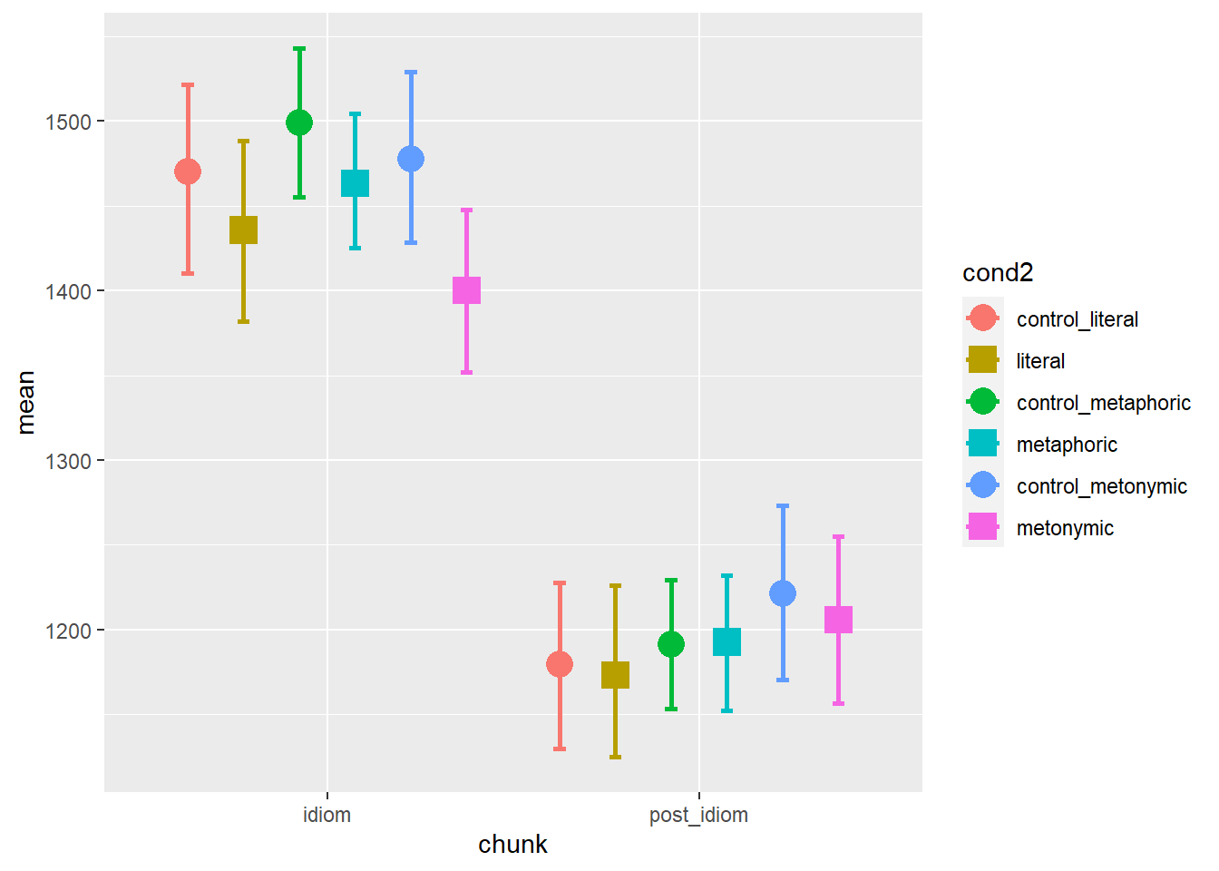
Now, let’s change the color palette of our plot. Since we are using shapes to differentiate between controls and idioms, we can color-code our control-target pairs. For now, let’s color literal idioms in purple, metaphors in dark green, and metonomies in light green. Although the resulting visual impact might be subtle, our line of reasoning is that, according to what we know about their semantic structure, literal idioms and metaphors lie at opposite ends of the non-literalness spectrum, metonomies lying somewhere in between the two. Our color code can reflect that intuition, regardless of the actual degree to which the reading patterns support the theoretically-motivated hypothesis that semantic structure affects the online processing of idioms.
mean_CI_RT_control %>%
  ggplot(aes(chunk, mean)) +
  geom_errorbar(aes(ymin = CILow, ymax = CIHigh, color = cond2), size = 1,
                position = position_dodge(.9), width = .2) +
  geom_point(aes(color = cond2, shape = cond2), size = 5,
             position = position_dodge(.9)) +
  scale_shape_manual(values = c("circle", "square", "circle", "square", "circle", "square")) +
  scale_color_manual(values = c("#762a83", "#762a83", "#1b7837", "#1b7837", "#d9f0d3", "#d9f0d3"))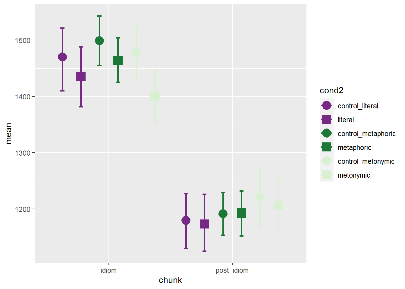
This looks, in part, quite good. We can very easily notice that, at the idiom region, literal idioms do not behave as hypothesized when compared to the other two idiom types. Still, there are two problems with the current plot, one major and one minor: the major problem is that the light green is barely recognizable against the gray background; the minor problem is that the current ordering of the levels in cond2, which is the variable encoding the expression types, does not reflect our desired categorization according to the semantic structure of the stimuli, whereby literal > metonymic > metaphoric is the literalness relation we are expecting to see translated in the reading patterns. Let’s change the background of our plot by applying theme_minimal() and let’s recode cond2 in order to reflect the desired ordering of the expression types.
mean_CI_RT_control$cond2 <- factor(mean_CI_RT_control$cond2, levels = c("control_literal", "literal", "control_metonymic", "metonymic", "control_metaphoric", "metaphoric"))

mean_CI_RT_control %>%
  ggplot(aes(chunk, mean)) +
  geom_errorbar(aes(ymin = CILow, ymax = CIHigh, color = cond2), size = 1,
                position = position_dodge(.9), width = .2) +
  geom_point(aes(color = cond2, shape = cond2), size = 5,
             position = position_dodge(.9)) +
  scale_shape_manual(values = c("circle", "square", "circle", "square", "circle", "square")) +
  scale_color_manual(values = c("#762a83", "#762a83", "#d9f0d3", "#d9f0d3", "#1b7837", "#1b7837")) +
  theme_minimal()
This looks better. Still, visually speaking, the light green representing metonomies is not contrasted enough with the white background. One tentative solution is to color the shape contours in black, which we already know we can do by using shapes that allow both fill and color aesthetic specifications. Let’s try doing that. Before we do so, however, take a look at the mapping for color within geom_errorbar() and geom_point(): we have the same variable, cond2, in both cases. Instead of specifying color twice, once for each geom, we can use a single specification in the superordinate ggplot() call, which means that the color = cond2 mapping will be used for all geoms ggplot() scopes over. Notice the difference in the code below, despite the output looking exactly the same.
mean_CI_RT_control %>%
  ggplot(aes(chunk, mean, color = cond2)) +
  geom_errorbar(aes(ymin = CILow, ymax = CIHigh), size = 1,
                position = position_dodge(.9), width = .2) +
  geom_point(aes(shape = cond2), size = 5,
             position = position_dodge(.9)) +
  scale_shape_manual(values = c("circle", "square", "circle", "square", "circle", "square")) +
  scale_color_manual(values = c("#762a83", "#762a83", "#d9f0d3", "#d9f0d3", "#1b7837", "#1b7837")) +
  theme_minimal()
Now let’s color the shape contours in black. In order to do that, remember, we would have to replace the color argument with a fill argument within geom_point(). Since there is no color argument within geom_point() anymore, we simply specify fill.
mean_CI_RT_control %>%
  ggplot(aes(chunk, mean, color = cond2)) +
  geom_errorbar(aes(ymin = CILow, ymax = CIHigh), size = 1,
                position = position_dodge(.9), width = .2) +
  geom_point(aes(fill = cond2, shape = cond2), color = "black", size = 5,
             position = position_dodge(.9)) +
  scale_shape_manual(values = c(21, 22, 21, 22, 21, 22)) +
  scale_color_manual(values = c("#762a83", "#762a83", "#d9f0d3", "#d9f0d3", "#1b7837", "#1b7837")) +
  theme_minimal()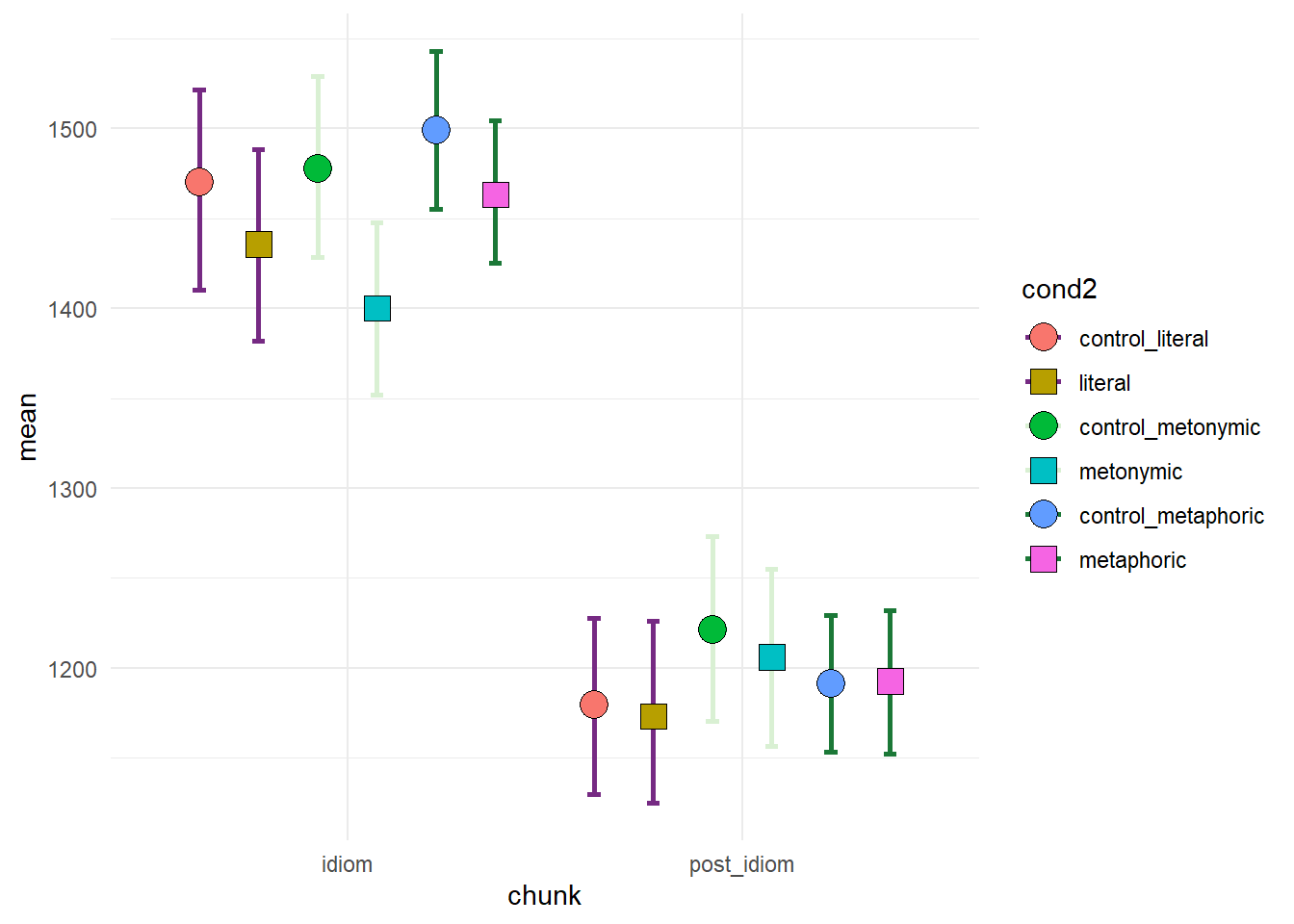
Notice how the shape contours are now colored black. And yet, the color of the shapes also changed, reverting back to the ggplot2 default. That is because we’re only manually specifying colors for the color aesthetic but not for the fill aesthetic. Let’s then add a scale_fill_manual() call with the desired color values. Let’s also slightly increase the size of the error bars, making them, in practice, thicker, and let’s slightl increase their transparency.
mean_CI_RT_control %>%
  ggplot(aes(chunk, mean, color = cond2)) +
  geom_errorbar(aes(ymin = CILow, ymax = CIHigh), size = 1.1,
                position = position_dodge(.9), width = .2, alpha = .7) +
  geom_point(aes(fill = cond2, shape = cond2), color = "black", size = 5,
             position = position_dodge(.9)) +
  scale_shape_manual(values = c(21, 22, 21, 22, 21, 22)) +
  scale_fill_manual(values = c("#762a83", "#762a83", "#d9f0d3", "#d9f0d3", "#1b7837", "#1b7837")) +
  scale_color_manual(values = c("#762a83", "#762a83", "#d9f0d3", "#d9f0d3", "#1b7837", "#1b7837")) +
  theme_minimal()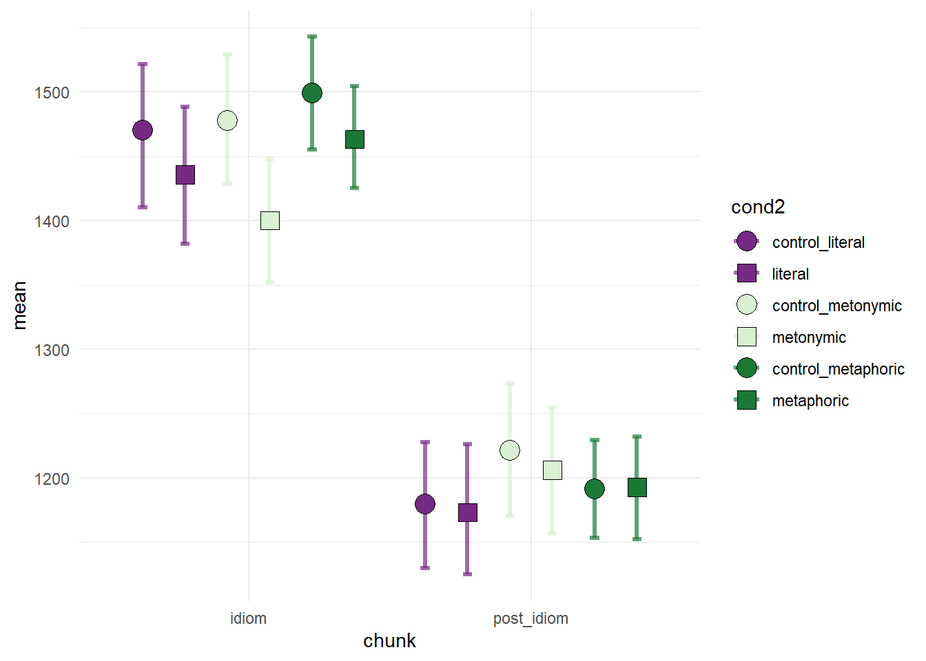
The change worked as intended. Still, the color palette we chose might not be ideal. Given that we’re using two shades of green, readers might be tempted to assume that the two green categories are more closely related to one another than they are to to the purple category, which is in fact correct, given that metaphors and metonomies are idiomatic but not literal, while literal idioms are, by definition, both idiomatic and literal. And yet, for the purposes of communicating the patterns in the processing data, we might want to highlight that these are three categorically distinct expression types, which are being analyzed as such. Let’s try to use a color palette that better serves our purposes. We’re coloring literal idioms in blue, metonomies in yellow, and metaphors in red.
mean_CI_RT_control %>%
  ggplot(aes(chunk, mean, color = cond2)) +
  geom_errorbar(aes(ymin = CILow, ymax = CIHigh), size = 1.1,
                position = position_dodge(.9), width = .2, alpha = .7) +
  geom_point(aes(fill = cond2, shape = cond2), color = "black", size = 5,
             position = position_dodge(.9)) +
  scale_shape_manual(values = c(21, 22, 21, 22, 21, 22)) +
  scale_fill_manual(values = c("#4575b4", "#4575b4", "#fee090", "#fee090", "#d73027", "#d73027")) +
  scale_color_manual(values = c("#4575b4", "#4575b4", "#fee090", "#fee090", "#d73027", "#d73027")) +
  theme_minimal()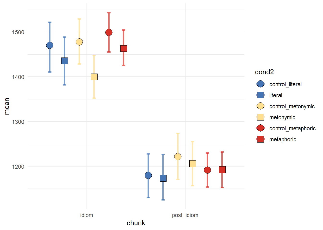
5.1.2 Refining minor elements of the plot
Now, let’s start making small amendments to the graph. In order to try and highlight the contrast between controls and idioms, we could change the color of the control error bars. We could, for example, plot the control error bars in black and the idiom error bars in color.
mean_CI_RT_control %>%
  ggplot(aes(chunk, mean, color = cond2)) +
  geom_errorbar(aes(ymin = CILow, ymax = CIHigh), size = 1.1,
                position = position_dodge(.9), width = .2, alpha = .7) +
  geom_point(aes(fill = cond2, shape = cond2), color = "black", size = 5,
             position = position_dodge(.9)) +
  scale_shape_manual(values = c(21, 22, 21, 22, 21, 22)) +
  scale_fill_manual(values = c("#4575b4", "#4575b4", "#fee090", "#fee090", "#d73027", "#d73027")) +
  scale_color_manual(values = c("black", "#4575b4", "black", "#fee090", "black", "#d73027")) +
  theme_minimal()
The change worked as intended, but maybe the plot is slightly too confusing now, with not only different shapes but also different colors both in the points and the error bars. Let’s revert the error bars back to how they were before, and let’s increase the thickness of the black contour around the plotted shapes, so as to increase the contrast between the shapes and the error bars. A simple way of doing that is by increasing the stroke aesthetic within geom_point().
mean_CI_RT_control %>%
  ggplot(aes(chunk, mean, color = cond2)) +
  geom_errorbar(aes(ymin = CILow, ymax = CIHigh), size = 1.1,
                position = position_dodge(.9), width = .2, alpha = .7) +
  geom_point(aes(fill = cond2, shape = cond2), color = "black", size = 5, stroke = 1.5,
             position = position_dodge(.9)) +
  scale_shape_manual(values = c(21, 22, 21, 22, 21, 22)) +
  scale_fill_manual(values = c("#4575b4", "#4575b4", "#fee090", "#fee090", "#d73027", "#d73027")) +
  scale_color_manual(values = c("#4575b4", "#4575b4", "#fee090", "#fee090", "#d73027", "#d73027")) +
  theme_minimal()
In some cases, modifying stroke might not do the job as we want it. Worse, assigning a single value to color might disrupt the legend. In order to avoid that, we can try an alternative which is to make use of the layer structure native to ggplot2. What we are going to do here is to plot two geom_point() layers with the exact same data, the back layer colored in black and the top layer colored according to the values specified in the color aesthetic. Notice how the back layer has larger shapes, which is what allows us to produce the black contours.
mean_CI_RT_control %>%
  ggplot(aes(chunk, mean, color = cond2)) +
  geom_errorbar(aes(ymin = CILow, ymax = CIHigh), size = 1.1,
                position = position_dodge(.9), width = .2, alpha = .7) +
  geom_point(aes(shape = cond2), color = "black", size = 5.5,
             position = position_dodge(.9)) +
  geom_point(aes(shape = cond2), size = 4,
             position = position_dodge(.9)) +
  scale_shape_manual(values = c("circle", "square", "circle", "square", "circle", "square")) +
  scale_fill_manual(values = c("#4575b4", "#4575b4", "#fee090", "#fee090", "#d73027", "#d73027")) +
  scale_color_manual(values = c("#4575b4", "#4575b4", "#fee090", "#fee090", "#d73027", "#d73027")) +
  theme_minimal()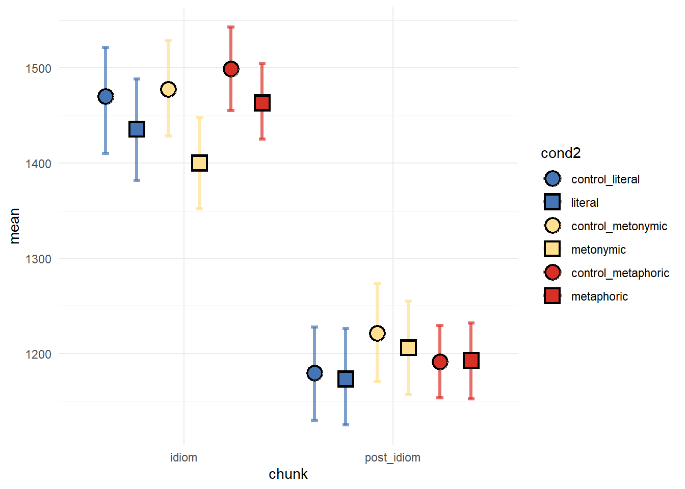
# ggsave("test-plot.png", dpi = 600)Now let’s modify the plot axes. We’ll start with by getting rid of the vertical lines extending from the region labels. We’ll also get rid of the axes labels.
mean_CI_RT_control %>%
  ggplot(aes(chunk, mean, color = cond2)) +
  geom_errorbar(aes(ymin = CILow, ymax = CIHigh), size = 1.1,
                position = position_dodge(.9), width = .2, alpha = .7) +
  geom_point(aes(shape = cond2), color = "black", size = 5.5,
             position = position_dodge(.9)) +
  geom_point(aes(shape = cond2), size = 4,
             position = position_dodge(.9)) +
  scale_shape_manual(values = c("circle", "square", "circle", "square", "circle", "square")) +
  scale_fill_manual(values = c("#4575b4", "#4575b4", "#fee090", "#fee090", "#d73027", "#d73027")) +
  scale_color_manual(values = c("#4575b4", "#4575b4", "#fee090", "#fee090", "#d73027", "#d73027")) +
  theme_minimal() +
  theme(axis.title.x = element_blank(), axis.title.y = element_blank(),
        panel.grid.major.x = element_blank())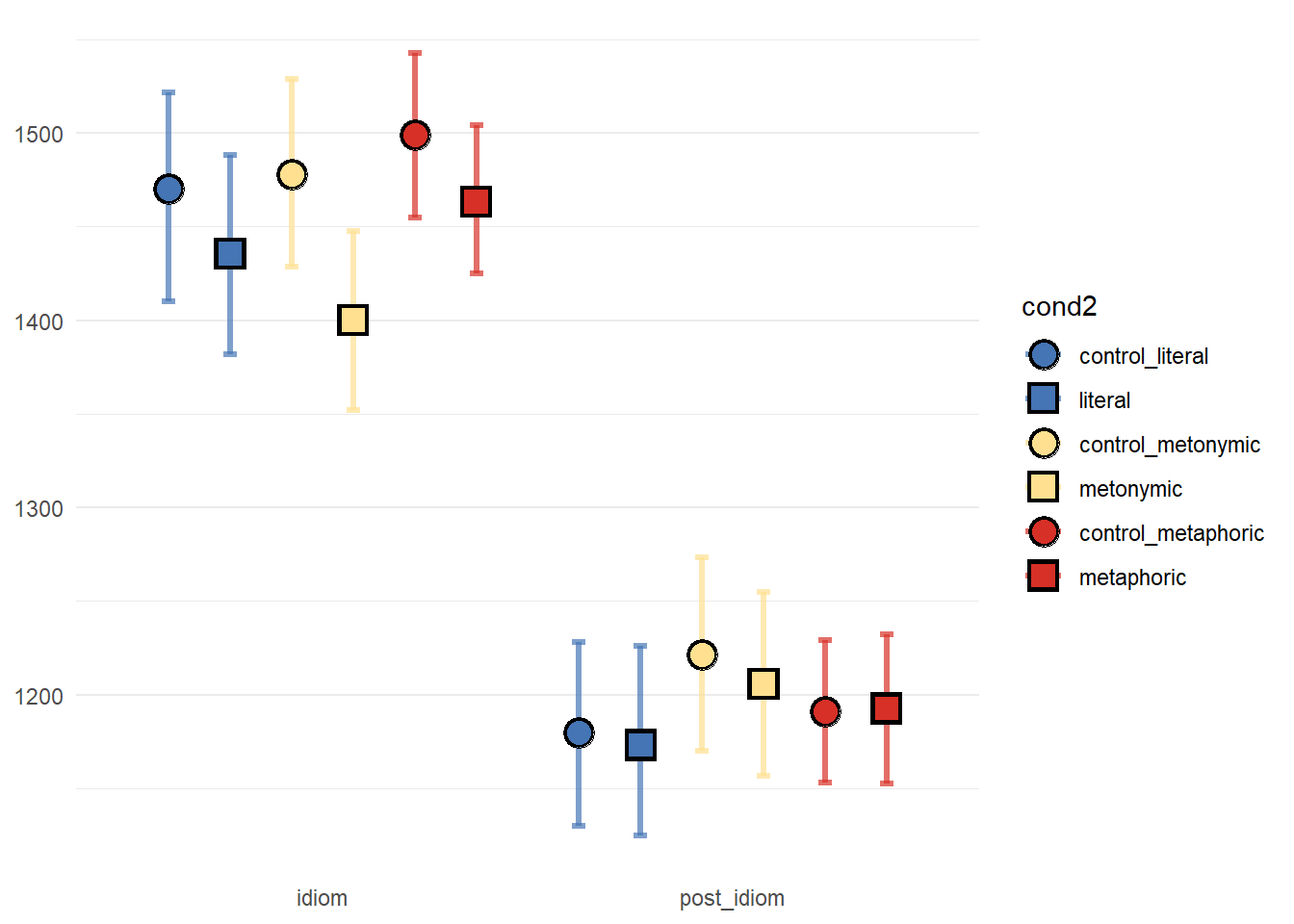
Next, we’re increasing the legibility of both the ticks and the labels.
mean_CI_RT_control %>%
  ggplot(aes(chunk, mean, color = cond2)) +
  geom_errorbar(aes(ymin = CILow, ymax = CIHigh), size = 1.1,
                position = position_dodge(.9), width = .2, alpha = .7) +
  geom_point(aes(shape = cond2), color = "black", size = 5.5,
             position = position_dodge(.9)) +
  geom_point(aes(shape = cond2), size = 4,
             position = position_dodge(.9)) +
  scale_shape_manual(values = c("circle", "square", "circle", "square", "circle", "square")) +
  scale_fill_manual(values = c("#4575b4", "#4575b4", "#fee090", "#fee090", "#d73027", "#d73027")) +
  scale_color_manual(values = c("#4575b4", "#4575b4", "#fee090", "#fee090", "#d73027", "#d73027")) +
  theme_minimal() +
  theme(axis.title.x = element_blank(), axis.title.y = element_blank(),
        panel.grid.major.x = element_blank(),
        axis.text.y = element_text(face = "bold", size = 10),
        axis.text.x = element_text(face = "bold", size = 14)) +
  scale_x_discrete(labels = c("idiom" = "Idiom", "post_idiom" = "Post-idiom"))
Now we’re increasing the distance between the ticks/ labels and the plot, and we’re adding a title to the plot.
mean_CI_RT_control %>%
  ggplot(aes(chunk, mean, color = cond2)) +
  geom_errorbar(aes(ymin = CILow, ymax = CIHigh), size = 1.1,
                position = position_dodge(.9), width = .2, alpha = .7) +
  geom_point(aes(shape = cond2), color = "black", size = 5.5,
             position = position_dodge(.9)) +
  geom_point(aes(shape = cond2), size = 4,
             position = position_dodge(.9)) +
  scale_shape_manual(values = c("circle", "square", "circle", "square", "circle", "square")) +
  scale_fill_manual(values = c("#4575b4", "#4575b4", "#fee090", "#fee090", "#d73027", "#d73027")) +
  scale_color_manual(values = c("#4575b4", "#4575b4", "#fee090", "#fee090", "#d73027", "#d73027")) +
  theme_minimal() +
  theme(axis.title.x = element_blank(), axis.title.y = element_blank(),
        panel.grid.major.x = element_blank(),
        axis.text.y = element_text(face = "bold", size = 10),
        axis.text.x = element_text(face = "bold", size = 14),
        plot.title = element_text(face = "bold", size = 24, hjust = .5,
                                  margin = margin(t = 10, r = 0, b = 40, l = 0))) +
  scale_x_discrete(labels = c("idiom" = "Idiom", "post_idiom" = "Post-idiom")) +
  ggtitle("Reading times")
The last thing to do is to modify the legend. We’re renaming the conditions and centering the legend title.
mean_CI_RT_control %>%
  ggplot(aes(chunk, mean, color = cond2)) +
  geom_errorbar(aes(ymin = CILow, ymax = CIHigh), size = 1.1,
                position = position_dodge(.9), width = .2, alpha = .7) +
  geom_point(aes(shape = cond2), color = "black", size = 5.5,
             position = position_dodge(.9)) +
  geom_point(aes(shape = cond2), size = 4,
             position = position_dodge(.9)) +
  scale_shape_manual(values = c("circle", "square", "circle", "square", "circle", "square")) +
  scale_fill_manual(values = c("#4575b4", "#4575b4", "#fee090", "#fee090", "#d73027", "#d73027"), name = "Expression type", labels = c("control_literal" = "Control", "literal" = "Literal", "control_metaphoric" = "Control", "metaphoric" = "Metaphoric", "control_metonymic" = "Control", "metonymic" = "Metonymic")) +
  scale_color_manual(values = c("#4575b4", "#4575b4", "#fee090", "#fee090", "#d73027", "#d73027"), name = "Expression type",
                    labels = c("control_literal" = "Control", "literal" = "Literal", "control_metaphoric" = "Control", "metaphoric" = "Metaphoric", "control_metonymic" = "Control", "metonymic" = "Metonymic")) +
  theme_minimal() +
  theme(axis.title.x = element_blank(), axis.title.y = element_blank(),
        panel.grid.major.x = element_blank(),
        axis.text.y = element_text(face = "bold", size = 10),
        axis.text.x = element_text(face = "bold", size = 14),
        plot.title = element_text(face = "bold", size = 24, hjust = .5,
                                  margin = margin(t = 10, r = 0, b = 40, l = 0)),
        legend.title.align = 0.5,) +
  scale_x_discrete(labels = c("idiom" = "Idiom", "post_idiom" = "Post-idiom")) +
  ggtitle("Reading times")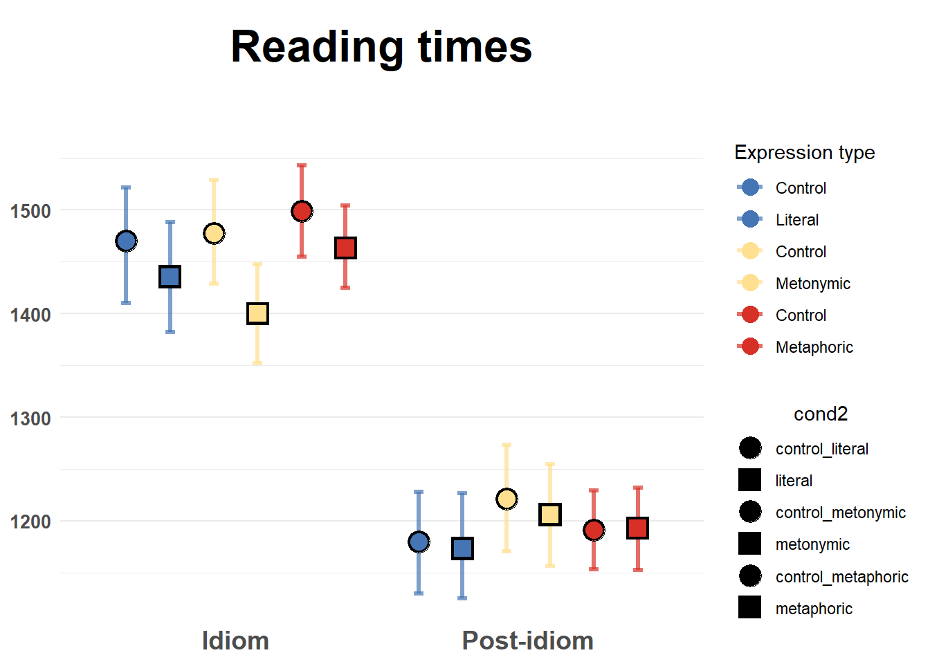
Something went wrong with the relabeling of the groups: we now have two legends. The reason behind that is that each aesthetic gets its own legend. By default, ggplot2 blends legends from different aesthetics together if they have the same titles and values. Since we’ve specified new names within scale_color_manual(), the color legend now has a different title as well as different values compared to the shape legend. In order to fix the issue, we need to specify the exact same names within scale_shape_manual(). Let’s make the change and see if it works.
mean_CI_RT_control %>%
  ggplot(aes(chunk, mean, color = cond2)) +
  geom_errorbar(aes(ymin = CILow, ymax = CIHigh), size = 1.1,
                position = position_dodge(.9), width = .2, alpha = .7) +
  geom_point(aes(shape = cond2), color = "black", size = 5.5,
             position = position_dodge(.9)) +
  geom_point(aes(shape = cond2), size = 4,
             position = position_dodge(.9)) +
  scale_shape_manual(values = c("circle", "square", "circle", "square", "circle", "square"), name = "Expression type",
                    labels = c("control_literal" = "Control", "literal" = "Literal", "control_metaphoric" = "Control", "metaphoric" = "Metaphoric", "control_metonymic" = "Control", "metonymic" = "Metonymic")) +
  scale_fill_manual(values = c("#4575b4", "#4575b4", "#fee090", "#fee090", "#d73027", "#d73027")) +
  scale_color_manual(values = c("#4575b4", "#4575b4", "#fee090", "#fee090", "#d73027", "#d73027"), name = "Expression type",
                    labels = c("control_literal" = "Control", "literal" = "Literal", "control_metaphoric" = "Control", "metaphoric" = "Metaphoric", "control_metonymic" = "Control", "metonymic" = "Metonymic")) +
  theme_minimal() +
  theme(axis.title.x = element_blank(), axis.title.y = element_blank(),
        panel.grid.major.x = element_blank(),
        axis.text.y = element_text(face = "bold", size = 10),
        axis.text.x = element_text(face = "bold", size = 14),
        plot.title = element_text(face = "bold", size = 24, hjust = .5,
                                  margin = margin(t = 10, r = 0, b = 40, l = 0)),
        legend.title.align = 0.5,) +
  scale_x_discrete(labels = c("idiom" = "Idiom", "post_idiom" = "Post-idiom")) +
  ggtitle("Reading times")
The legend now looks fine. To finish up, we could try increasing the transparency of our controls, to highlight the contrast with the idioms. Notice, however, that when using multiple layers transparency might not work as intended.
mean_CI_RT_control %>%
  ggplot(aes(chunk, mean, color = cond2, alpha = .7)) +
  geom_errorbar(aes(ymin = CILow, ymax = CIHigh), size = 1.1,
                position = position_dodge(.9), width = .2) +
  geom_point(aes(shape = cond2), color = "black", size = 5.5,
             position = position_dodge(.9)) +
  geom_point(aes(shape = cond2), size = 4,
             position = position_dodge(.9)) +
  scale_alpha_continuous(guide = FALSE) +
  scale_shape_manual(values = c("circle", "square", "circle", "square", "circle", "square"), name = "Expression type",
                    labels = c("control_literal" = "Control", "literal" = "Literal", "control_metaphoric" = "Control", "metaphoric" = "Metaphoric", "control_metonymic" = "Control", "metonymic" = "Metonymic")) +
  scale_fill_manual(values = c("#4575b4", "#4575b4", "#fee090", "#fee090", "#d73027", "#d73027")) +
  scale_color_manual(values = c("#4575b4", "#4575b4", "#fee090", "#fee090", "#d73027", "#d73027"), name = "Expression type",
                    labels = c("control_literal" = "Control", "literal" = "Literal", "control_metaphoric" = "Control", "metaphoric" = "Metaphoric", "control_metonymic" = "Control", "metonymic" = "Metonymic")) +
  theme_minimal() +
  theme(axis.title.x = element_blank(), axis.title.y = element_blank(),
        panel.grid.major.x = element_blank(),
        axis.text.y = element_text(face = "bold", size = 10),
        axis.text.x = element_text(face = "bold", size = 14),
        plot.title = element_text(face = "bold", size = 24, hjust = .5,
                                  margin = margin(t = 10, r = 0, b = 40, l = 0)),
        legend.title.align = 0.5,) +
  scale_x_discrete(labels = c("idiom" = "Idiom", "post_idiom" = "Post-idiom")) +
  ggtitle("Reading times")
One possible fix is to use scale_alpha_manual() to have a higher degree of control over which levels become [more] transparent.
mean_CI_RT_control %>%
  ggplot(aes(chunk, mean, color = cond2)) +
  geom_errorbar(aes(ymin = CILow, ymax = CIHigh, alpha = cond2), size = 1.1,
                position = position_dodge(.9), width = .2) +
  geom_point(aes(shape = cond2, alpha = cond2), color = "black", size = 5.5,
             position = position_dodge(.9)) +
  geom_point(aes(shape = cond2), size = 4,
             position = position_dodge(.9)) +
  scale_alpha_manual(values = c(.5, .9, .5, .9, .5, .9), guide = FALSE) +
  scale_shape_manual(values = c("circle", "square", "circle", "square", "circle", "square"), name = "Expression type",
                    labels = c("control_literal" = "Control", "literal" = "Literal", "control_metaphoric" = "Control", "metaphoric" = "Metaphoric", "control_metonymic" = "Control", "metonymic" = "Metonymic")) +
  scale_fill_manual(values = c("#4575b4", "#4575b4", "#fee090", "#fee090", "#d73027", "#d73027")) +
  scale_color_manual(values = c("#4575b4", "#4575b4", "#fee090", "#fee090", "#d73027", "#d73027"), name = "Expression type",
                    labels = c("control_literal" = "Control", "literal" = "Literal", "control_metaphoric" = "Control", "metaphoric" = "Metaphoric", "control_metonymic" = "Control", "metonymic" = "Metonymic")) +
  theme_minimal() +
  theme(axis.title.x = element_blank(), axis.title.y = element_blank(),
        panel.grid.major.x = element_blank(),
        axis.text.y = element_text(face = "bold", size = 10),
        axis.text.x = element_text(face = "bold", size = 14),
        plot.title = element_text(face = "bold", size = 24, hjust = .5,
                                  margin = margin(t = 10, r = 0, b = 40, l = 0)),
        legend.title.align = 0.5,) +
  scale_x_discrete(labels = c("idiom" = "Idiom", "post_idiom" = "Post-idiom")) +
  ggtitle("Reading times")
Alternatively, we could color our controls black, and use a different shape for each control-target pair.
mean_CI_RT_control %>%
  ggplot(aes(chunk, mean, color = cond2, alpha = cond2)) +
  geom_errorbar(aes(ymin = CILow, ymax = CIHigh), size = 1.1,
                position = position_dodge(.9), width = .2) +
  geom_point(aes(shape = cond2), color = "black", size = 5.5,
             position = position_dodge(.9)) +
  geom_point(aes(shape = cond2), size = 4,
             position = position_dodge(.9)) +
  scale_alpha_manual(values = c(.5, .9, .5, .9, .5, .9), guide = FALSE) +
  scale_shape_manual(values = c("circle", "circle", "square", "square", "triangle", "triangle"), name = "Expression type",
                    labels = c("control_literal" = "Control", "literal" = "Literal", "control_metaphoric" = "Control", "metaphoric" = "Metaphoric", "control_metonymic" = "Control", "metonymic" = "Metonymic")) +
  scale_fill_manual(values = c("black", "#4575b4", "black", "#fee090", "black", "#d73027")) +
  scale_color_manual(values = c("black", "#4575b4", "black", "#fee090", "black", "#d73027"), name = "Expression type",
                    labels = c("control_literal" = "Control", "literal" = "Literal", "control_metaphoric" = "Control", "metaphoric" = "Metaphoric", "control_metonymic" = "Control", "metonymic" = "Metonymic")) +
  theme_minimal() +
  theme(axis.title.x = element_blank(), axis.title.y = element_blank(),
        panel.grid.major.x = element_blank(),
        axis.text.y = element_text(face = "bold", size = 10),
        axis.text.x = element_text(face = "bold", size = 14),
        plot.title = element_text(face = "bold", size = 24, hjust = .5,
                                  margin = margin(t = 10, r = 0, b = 40, l = 0)),
        legend.title.align = 0.5,) +
  scale_x_discrete(labels = c("idiom" = "Idiom", "post_idiom" = "Post-idiom")) +
  ggtitle("Reading times")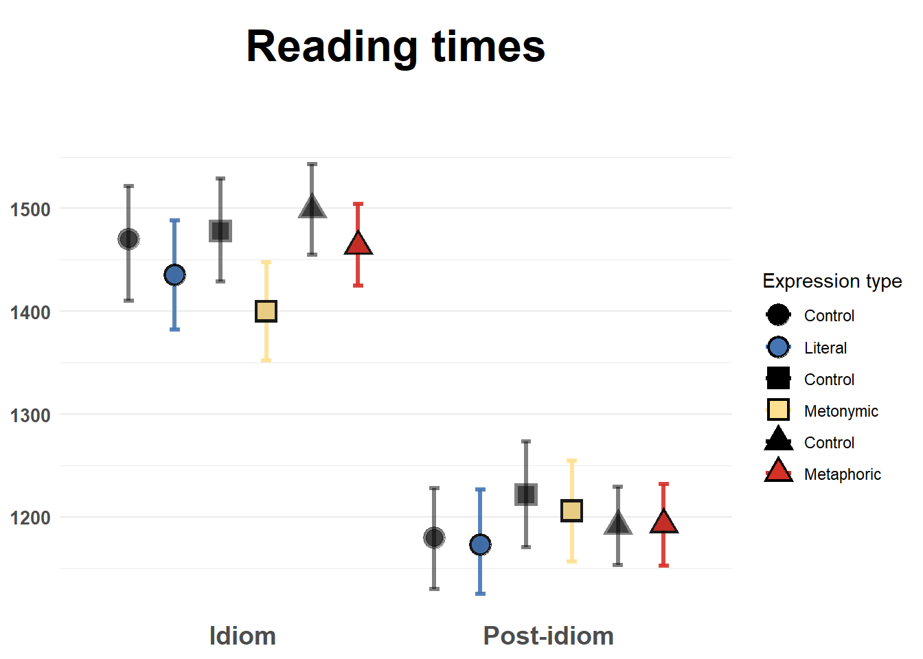
5.2 Session summary
Today we learned how to improve visualizations that involve point estimates, or summary statistics, as opposed to whole distributions or intervals of data. Most importantly, we explored different ways of highlighting our contrasts of interest, which in the case of the data at hand were theoretically-motivated contrasts between sets of experimental items;
The major visual/ aesthetic element we modified in the plot was the color and the shapes of the plotted groups. We saw that we can combine these two aesthetics in different ways so as to highlight our contrasts of interest, which might involve subtle differences between groups. Certain combinations of aesthetics might be more visually striking than others, though at the end of the day these are design choices that are influenced by individual preferences from the side of the analyst. Aside from major aesthetic changes and other general improvements to the plot such as adding a title and customizing the legend, we made minor improvements to the plot involving changing the grid lines in the background and increasing the distance between the plotted points.