Session 3 Exploring and communicating patterns in rating data
3.1 Laying out the data
Last session we got an introduction on how to use ggplot2 to plot data in R. We saw that with the basics in place, which are the data to be plotted as well as at least one geom, a graphical primitive in R, we can create graphs which allow us to visualize our data, being up to us as analysts to decide what specific format and what design choices best suit our visualization needs. Today we will dig deeper into how to visualize data using gpplot2, first by seeing some examples of how to explore different patterns of interest in a data set and then by creating visualizations which not only highlight the most relevant patterns in the data but which also look refined and visually pleasing. We will be visualizing data from the first of the two studies introduced last session, in which the primary question of interest was whether metaphors and metonomies, both of which forms of non-literal language, differ in their perceived degree of literalness. Recall that in this study the author asked groups of people to rate both types of idiomatic expressions along a number of dimensions tied to literalness, namely familiarity, transparency, and non-literalness. Let’s focus our attention on the ratings for transparency, which encompasses two distinct properties, comprehensibility and relation.
As the author of the study puts it, comprehensibility, as a feature of transparency, relates to “[…] the ease with which the meaning of an idiomatic unit can be recovered” (Michl, 2019a). In addition to comprehensibility, the relatedness between the literal and non-literal meaning of an idiom also matters for its perceived transparency. Indeed, as the author explains in the paper, the notion of relation “[…] defines the strength of the semantic or conceptual link between the literal and the idiomatic meaning of an idiom”. With these two notions in mind, let’s then turn to the ratings themselves. As we can see, comprehensibility and relation are theoretical constructs which capture the nature of idiom transparency from two different angles, yet they may or may not overlap with one another in the ratings measured empirically. In the study we are concerned with, people were asked to rate 244 different idioms. As a reminder of what these idioms might look like, let’s take a look at an example of each type of expression, taken from the sample used in the study.
Metaphor - das Eis brechen - to break the ice = to relax a socially stiff/ uncomfortable situation
Metonomy - die Nase rümpfen - to wrinkle one’s nose = to be contemptuous or disgusted
Now, let’s start plotting the comprehensibility ratings, which range from 1, extremely difficult to understand, to 5, extremely easy to understand. For that, let’s recycle some code from last session, where we already plotted similar ratings using colored bars to indicate the different expression types. Instead of plotting the raw numbers, let’s make sure to plot the proportion of ratings as a function of the expression types, which is a more reader-friendly plotting option compared to using raw counts.
rat_comp %>%
  ggplot(aes(x = rat)) +
  geom_bar(aes(y = ..prop.., fill = type, group = type), stat = "count", position = position_dodge())
As the plot shows us, at least on the surface, the two types of expression look very similar in terms of their perceived comprehensibility. Given the selected sample of idioms, respondents seem to find, on average, both metaphors and metonomies quite easy to understand. And yet this finding is is not necessarily transparent when one looks at the plot. On the one hand, it is obvious by looking at it that most of the rating mass is concentrated on the upper end of the scale, over points 4 and 5. On the other hand, however, it is not immediately evident what the central tendency of the response distribution is. Since we are talking about ordinal data here, our preferred measure of central tendency is the median, which seems to be around 4, but this is a guess based on eyeballing the data and roughly estimating it. Before assuming that 4 is the actual median rating, let’s calculate the median directly. For that we will turn to our trusted dplyr package from the tidyverse, which we’ve already used to wrangle data before.
So what we want to do here is to calculate the median for each group of interest. Medians can be calculated in R using the function median(), which according to the documentation can be used to compute the sample median and is to be applied to a numeric vector containing the values whose median is to be computed. Now, since we want the median of each group, and not just the overall sample median, we need to group the data. Thanks to dplyr, that is easily done using group_by(), inside of which we specify our grouping variable, in this case type. Next, what we need to do is to call our summary statistic function, median(), inside of a summarize() call, which creates a new data frame with our summary of interest. Let’s try that.
rat_comp %>%
  group_by(type) %>%
  summarize(median = median(rat))
## `summarise()` ungrouping output (override with `.groups` argument)## # A tibble: 2 x 2
## type median
## <chr> <dbl>
## 1 metaphoric 4
## 2 metonymic 4The calculated summary statistic confirms our rough guess that the median rating of both metaphors and metonomies is 4. But this still leaves us with the question of how to improve our visualization such that this pattern of interest becomes more noticeable. There might be ways of changing the current plot so as to make the medians stand out, but one more practical solution is to completely re-think our choice of a graph. Notice how we’ve been using the geom_bar() geom so far, but maybe there are better alternatives in the geoms available in ggplot2. Let’s explore a little. What we have done so far is to plot one variable, namely rat, the resulting graph showing bars either with the raw response counts or with different proportions of responses according to each expression type, which we achieved using fill(). What if we tried to assign type to one of the axes instead of using fill() to add it to the graph? Let’s try that, and let’s use another geom instead, since geom_bar() only plots one variable. We can start by giving geom_point() a try, which plots each response as a point. Let’s assign type to the x-axis and rat to the y-axis.
rat_comp %>%
  ggplot(aes(type, rat)) +
  geom_point()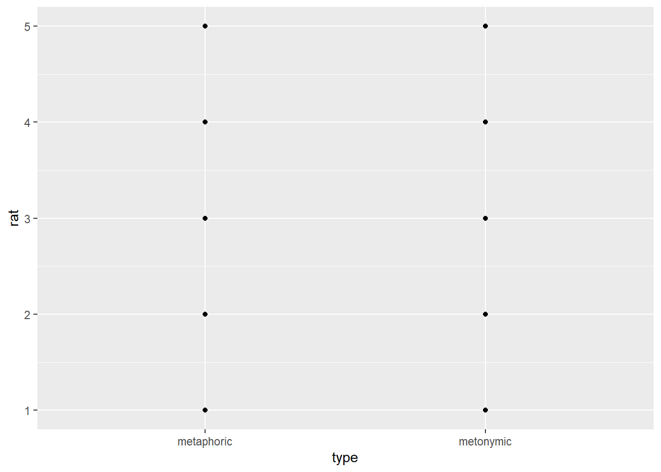
Our code does exactly what we tell it to do: it plots the ratings on the y-axis and the groups as two distinct ‘columns’ on the x-axis. But why does the plot look so weird, as if there was only one data point for each point on the rating scale? Well, the reason is that geom_point() is useful for displaying the relationship between two continuous variables, as would be the case for interval or ratio data. What we have at hand is two discrete variables, one ordinal and one dichotomous, so our data points are in fact all there, but, since our rating scale consists of discrete points, the responses are overplotted. Let’s use another geom to declutter the overplotted graph and reveal the underlying response points. We’ll use geom_jitter(), which according to the documentation adds a small amount of random variation to the location of each plotted point, such that it is a useful way of handling overplotting caused by discreteness.
rat_comp %>%
  ggplot(aes(type, rat)) +
  geom_jitter()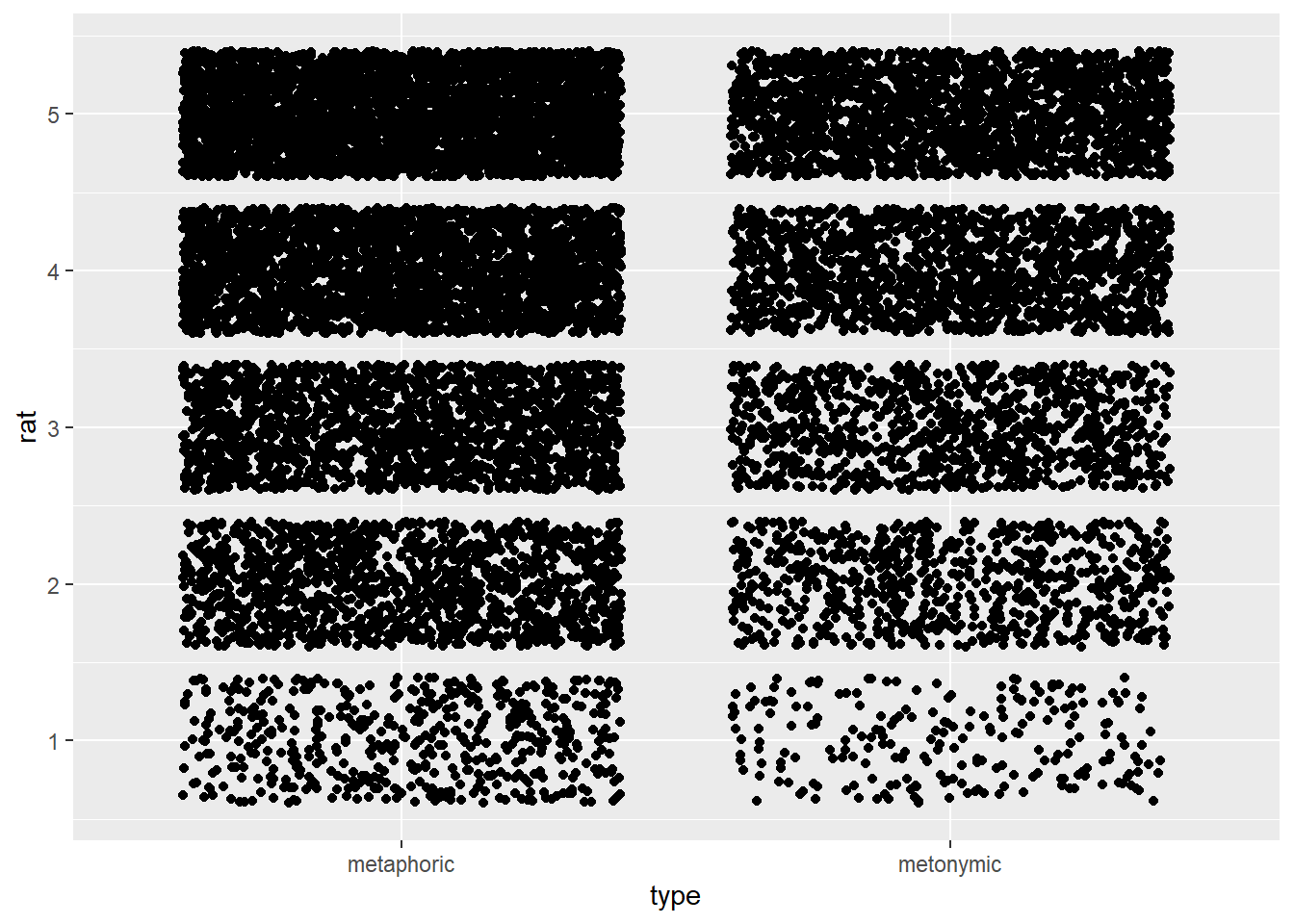
With geom_jitter() we’re able to see all the responses, which are clustered around each point on the rating scale. Remember that we were interested in being able to spot where most of the rating mass lies on the scale, so it might make sense to plot the scale horizontally, so one can easily notice the data spread for each expression type as well any differences between the two groups, which will be plotted one on top of the other. Let’s try to achieve that by reversing our x and y arguments in the ggplot() function.
rat_comp %>%
  ggplot(aes(rat, type)) +
  geom_jitter()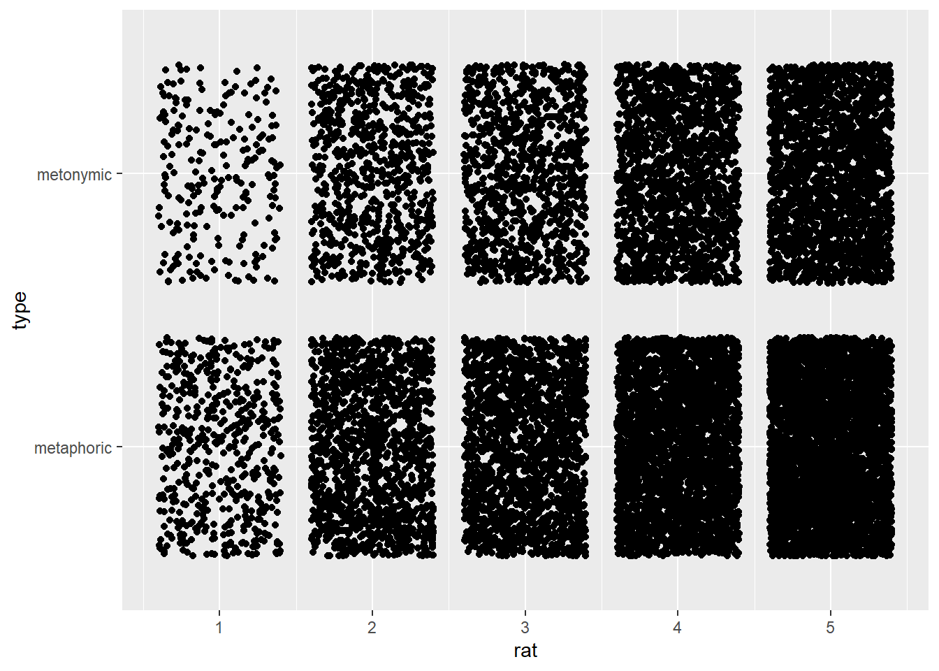
This jittered plot looks more intuitive than the previous one, but even after reversing the axes we still end up with a plot which is not particularly informative; if anything our original barplot was more informative. Let’s try another solution then, namely another geom, geom_count(). According to the documentation, geom_count() is a variant of geom_point() which counts the number of observations of each location and then maps the count to a point area.
rat_comp %>%
  ggplot(aes(rat, type)) +
  geom_count()
This again somewhat resembles our original barplot insofar as we get a visual correlate of the amount of responses for each point on the rating scale. Still, this plot is arguably much less informative than the original barplot. So do we settle for a barplot or do we try some more alternatives? Let’s try some more alternatives. So far we’ve tried geoms which take either two continuous variables or two discrete variables. ggplot2 also has geoms which take one discrete and one continuous variable. Even though the ratings we are plotting are ordinal in nature, they are represented in R as a numeric variable, which we can double-check via a str() call.
str(rat_comp$rat)## num [1:16492] 4 2 2 1 1 2 3 3 2 1 ...R represents vectors containing numbers as numeric by default, regardless of what these numbers actually represent. We could have converted rat to a factor to reflect the nature of its original measurement type, but keeping it as a numeric vector was useful for calculating the median earlier on. Still, what that means is that we are plotting rat as a continuous variable, which is useful for the geom we’re using next, geom_boxplot(). Boxplots, or box-and-whisker plots as they are also called, are a very useful way of graphically representing numeric data when one is interested in the quartiles or percentiles of the data distribution. The median itself is the 50th percentile, that is, the point which divides the data distribution in two. The lower and uppers quartiles represent the 25th and the 75th percentiles, respectively. Let’s take a look at our graph and see how all that is represented in a boxplot.
rat_comp %>%
  ggplot(aes(rat, type)) +
  geom_boxplot()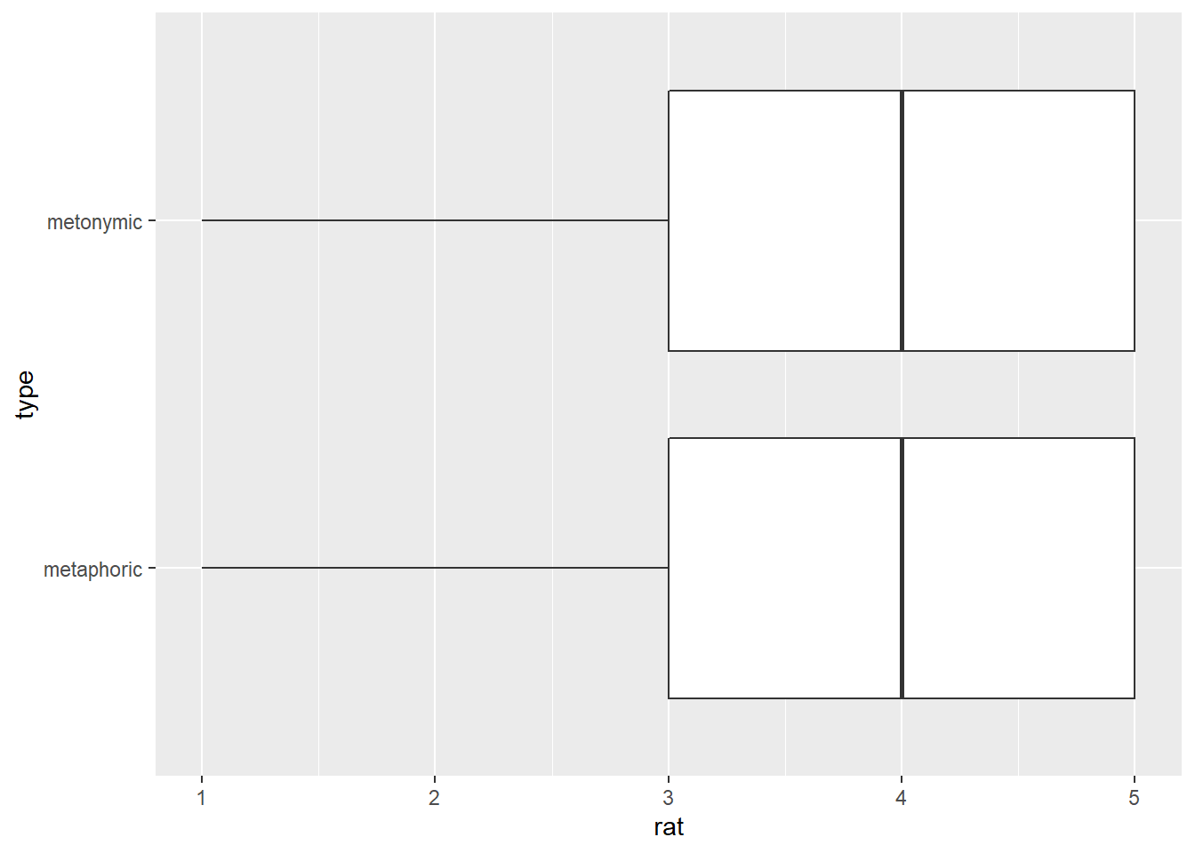
What this plot tells us is that for both expression types 4 corresponds to the 50th percentile of the data, that is, to the median point in the rating distribution. This is marked by a thick vertical black line in the plot. Moreover, the plot tells us that 3 and 5 are the 25th and 75th percentiles, respectively, which means that half of the data mass lies between these two points. These percentiles are marked by thin vertical black lines, which enclose the area colored in white and halved by the median line. The lines extending from the ‘boxes’ in the graph, the so-called ‘whiskers’, indicate values that lie within a deviation of 1.5 x the range marked by the 25th and 75th percentiles, which is called the interquartile range. Importantly for our current purposes, such a plot gives us both our desired measure of central tendency as well as information about the spread of the data, all readily available as part of the geom itself.
Before we move on, let’s look at one last geom, geom_violin(). A plot produced with geom_violin() resembles a boxplot except that it has the shape of a density distribution, which may or may not come in handy.
rat_comp %>%
  ggplot(aes(rat, type)) +
  geom_violin()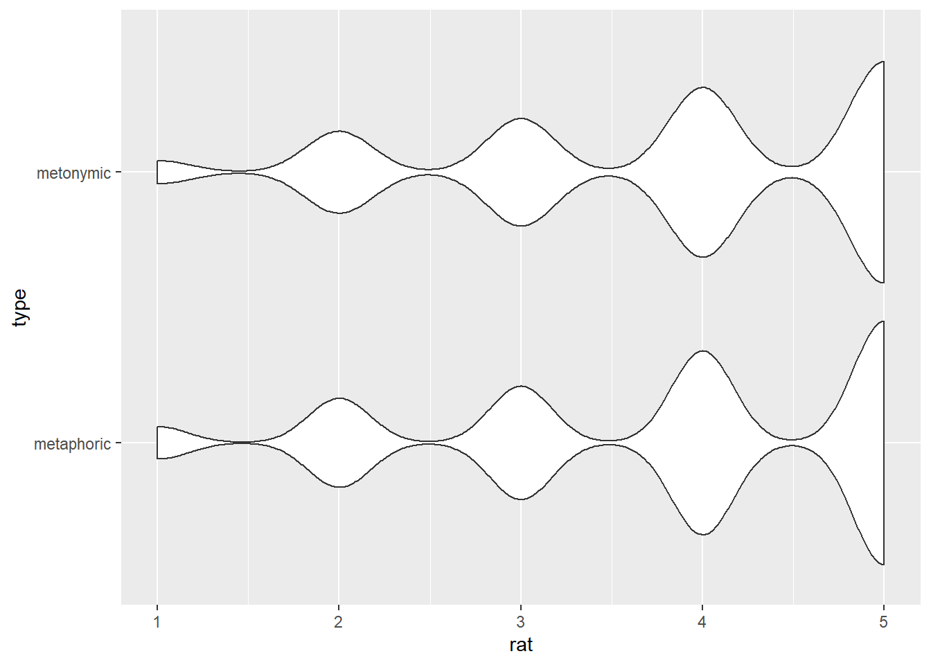
In our case, such a violin plot is not particularly informative, and that is because our data, despite being represented as continuous, actually consists of discrete response bins clustered around each of the five points of the rating scale. We will therefore stick with our boxplot from above, which was the most informative graph for our purposes, perhaps alongside the barplot. Now that we have settled on the type of graph we will be using for our visualization, let’s plot the other transparency measure, the relation ratings.
rat_rel %>%
  ggplot(aes(rat, type)) +
  geom_boxplot()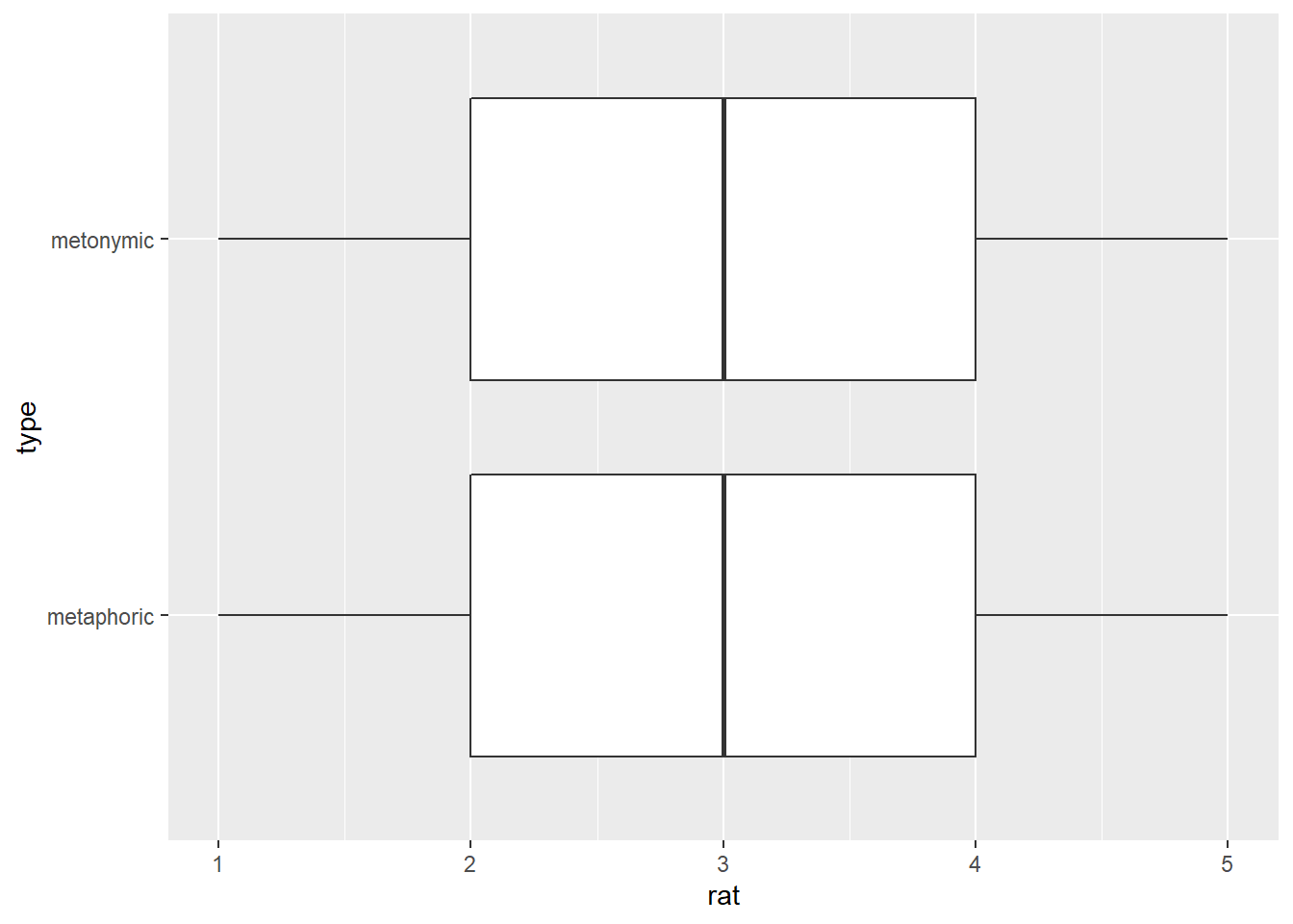
Given the selected sample of idioms, respondents seem to find that both in the case of metaphors and metonomies their literal and non-literal meanings are neither extremely distantly or not at all related nor extremely closely related. That is to say that, on average, the literal and non-literal meanings of both types of expressions is perceived as not particularly closely or distantly related, which may be expected given the large number of items in the study and inherent variability between items.
Now that we have both the comprehensibility and the relation ratings, we might want to combine them in a single plot, given that both measures relate to the notion transparency. In order to do that, we will create a graph that shows the correlation between the two response distributions on the basis of visual overlap between the data. First, we need to combine the two data sets, so we can have a single data frame to feed to ggplot().
rat_combi <- bind_rows(rat_comp, rat_rel, .id = "study")Now that we have a combined data frame, let’s plot it using a boxplot, just like we did above. In order to highlight the different measures, we will need to add the variable study to the plot, which we created in our bind_rows() call above. If we inspect rat_combi, we’ll see that study has 1 and 2 as default IDs for our two transparency measures, so we should probably change that to something more meaningful, to make our lives easier. We’re using a function called fct_recode() from the tidyverse package forcats. Note that study is not actually coded as a factor in our data frame but rather as character, which is the R default for vectors containing strings. That is not a problem in itself as we can still use fct_recode() to change the labels associated with the values recorded in study. Let’s call the comprehensibility measure comp and the relation measure rel.
str(rat_combi$study)## chr [1:37138] "1" "1" "1" "1" "1" "1" "1" "1" "1" "1" "1" "1" "1" "1" "1" ...rat_combi$study <- fct_recode(rat_combi$study, comp = "1", rel = "2")
str(rat_combi$study)## Factor w/ 2 levels "comp","rel": 1 1 1 1 1 1 1 1 1 1 ...Now let’s plot the combined ratings, just like we did above with only one measure. Here, we will add the information about the measures as a fill() within our geom_boxplot() call. Note how we are using color here to highlight the source of the ratings, or in other words, what measure they refer to, while we are mapping our expression type directly onto the y-axis.
rat_combi %>%
  ggplot(aes(rat, type)) +
  geom_boxplot(aes(fill = study))
With this plot, we can directly compare our two transparency measures. Of course, we could also reverse the current visual scheme and map the study source to the y-axis and use color to indicate the expression type, like below. This second rendition might be more informative if we would like to highlight both the contrast between the expressions types and the one between the measures themselves.
rat_combi %>%
  ggplot(aes(rat, study)) +
  geom_boxplot(aes(fill = type))
One thing left to do before we move on is to make some minor visual improvements to the plot. Later today we will make further changes to these plots to increase their legibility and clarity, but for now let’s simply dodge the boxes a little bit, so they’re not so close to one another. Within our geom, we can specify the same argument we specified last session when working with barplots, namely position = position_dodge(). Since the boxes in boxplots are already slightly ‘dodged’ by default, we can increase the distance between them by modifying the argument width within position_dodge().
rat_combi %>%
  ggplot(aes(rat, study)) +
  geom_boxplot(aes(fill = type), position = position_dodge(width = .9))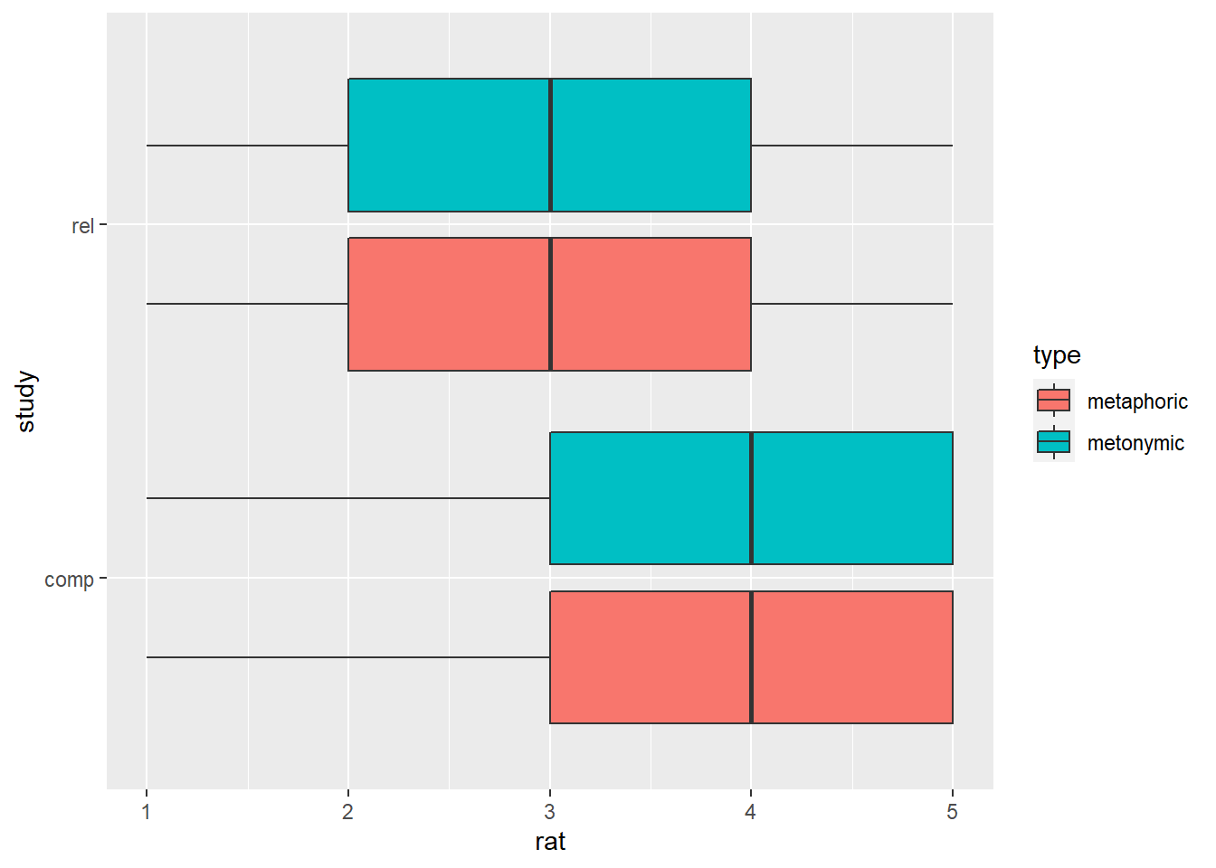
We’ve increased the distance between the boxes in each group, but what if we also wanted to increase the distance between the two groups? Well, we can then modify the width argument within geom_boxplot(), which is a separate argument as the one nested within position_dodge(). Let’s try that out.
rat_combi %>%
  ggplot(aes(rat, study)) +
  geom_boxplot(aes(fill = type), width = .9, position = position_dodge(width = .9))
This didn’t work the way we wanted to, and that’s because we’re now dealing with two width parameters, so we need to adjust them accordingly until we find a balance that suits our needs. Let’s reduce the distance between groups.
rat_combi %>%
  ggplot(aes(rat, study)) +
  geom_boxplot(aes(fill = type), width = .5, position = position_dodge(width = .9))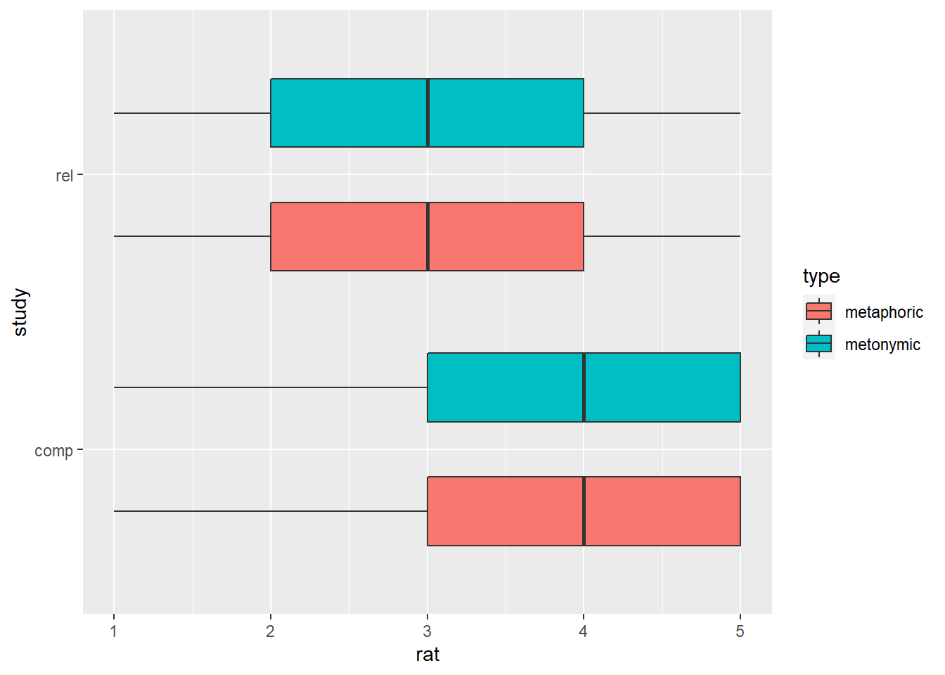
We’re getting there, but we should probably reduce the distance between the paired boxes a tiny bit as well.
rat_combi %>%
  ggplot(aes(rat, study)) +
  geom_boxplot(aes(fill = type), width = .5, position = position_dodge(width = .7))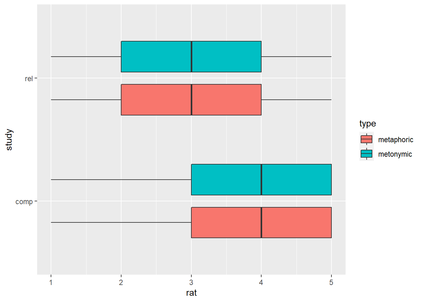
This plot looks good. By inspecting it, one can see that there are no differences in how the two idiom types are perceived, neither in terms of their comprehensibility nor in terms of the relation between their literal and non-literal meanings. There is, however, a difference between the two transparency measures, such that both metaphors and metonomies are perceived, on average, as easy to understand despite their literal and non-literal meanings not being perceived as particularly related. Let’s now explore the data a bit more to see if there are other interesting patterns worth highlighting and communicating.
3.2 Exploring the data
Before working on improving our plots, we’ll explore our data some more. A detailed account of the hows and whys of exploring data, as part of a data analytic pipeline, is something that goes much beyond the scope of this course and which is directly tied to the specific practices and standards of a research field as well as to specific methods employed to measure and analyze data. Having said that, it’s important to understand what the goal of data exploration might be, and how it might fit within the larger picture of data analysis.
Analysis of empirical data can be roughly divided into exploratory and confirmatory strands. With exploratory analyses one attempts to describe and summarize the main characteristics of a data set, as a representative snapshot of a given phenomenon, possibly with the intention of generating hypotheses for further empirical testing. In a study which is exploratory in nature, the researchers do not state specific hypotheses about the data they are analyzing, despite having a research question and specific empirical and possibly theoretical goals. With confirmatory analyses, on the other hand, also known as hypothesis testing, one attempts to answer a research question which is formulated in terms of a specific hypothesis or sets of hypotheses, usually accompanied by an [explicit] alternative hypothesis or sets of alternative hypotheses. In a study which is confirmatory in nature, the researchers attempt to confirm hypotheses which they formulate before collecting and analyzing the data. In practice, data exploration and hypothesis testing are complementary aspects of empirical research, such that exploring one data set might lead to generating hypotheses, and possibly building theories, which can be tested explicitly using another data set. While testing hypotheses which are different from the ones formulated beforehand is considered bad practice in confirmatory research, data exploration is something that can and is expected to happen in addition to hypothesis testing, either cumulatively across different studies which rely on different data sets or as part of a single study before any hypotheses are generated and tested.
The study we are focusing on today can be characterized as exploratory, and as such exploring the data beyond the main contrasts of interest might be particularly fruitful. Given that we are not experts in the particular empirical/ theoretical domain the study is situated in, generating hypotheses for future empirical testing would probably be wishful thinking, and it also escapes the purpose of this exercise. We can, nevertheless, look at the data and see if there’s any interesting descriptive pattern worth highlighting. Given that we have already explored the transparency ratings to some degree in the previous section, let’s look at some of the other variables which are recorded in the data set. Let’s use our trusted str() function to generate an overview of the data frame. Alternatively, we can also view the data by clicking on it in our environment panel on the top right of RStudio.
str(rat_combi)## tibble [37,138 x 9] (S3: spec_tbl_df/tbl_df/tbl/data.frame)
## $ study : Factor w/ 2 levels "comp","rel": 1 1 1 1 1 1 1 1 1 1 ...
## $ part_id: num [1:37138] 460 460 460 460 460 460 460 460 460 460 ...
## $ gender : chr [1:37138] "female" "female" "female" "female" ...
## $ age : num [1:37138] 31 31 31 31 31 31 31 31 31 31 ...
## $ state : chr [1:37138] "Niedersachen" "Niedersachen" "Niedersachen" "Niedersachen" ...
## $ educ : chr [1:37138] "Hoch/Fachhochschul" "Hoch/Fachhochschul" "Hoch/Fachhochschul" "Hoch/Fachhochschul" ...
## $ item : num [1:37138] 1 2 3 4 5 6 7 8 9 10 ...
## $ rat : num [1:37138] 4 2 2 1 1 2 3 3 2 1 ...
## $ type : chr [1:37138] "metaphoric" "metaphoric" "metaphoric" "metaphoric" ...
## - attr(*, "spec")=
## .. cols(
## .. part_id = col_double(),
## .. gender = col_character(),
## .. age = col_double(),
## .. state = col_character(),
## .. educ = col_character(),
## .. item = col_double(),
## .. rat = col_double(),
## .. type = col_character()
## .. )In addition to our main variables of interest rat and type, which we are already familiar with, we also see other variables which relate to the study per se, such as part_id and item, as well as basic demographic information about the respondents, like age, gender, and educ. Even though we don’t know what a theory of non-literal language might say about the relation between perceived idiom transparency and traits like gender or age of a language user, we might expect there to be differences in how, for example, young and older language users perceive the comprehensibility of metaphors, or in how users with a higher or lower level of formal education perceive the relation between the literal and non-literal meaning of such expressions. Let’s then start by plotting our ratings from above in terms of different sub-populations of our sample. To simplify our job for now, let’s plot only the comprehensibility ratings, and let’s use color to help us visualize any differences between our two expression types.
rat_comp %>%
  ggplot(aes(rat, type)) +
  geom_boxplot(aes(fill = type))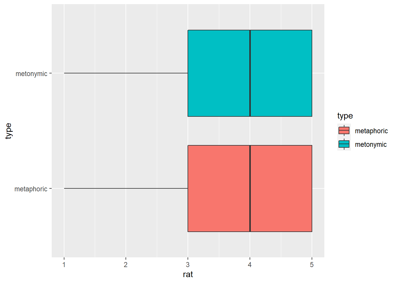
To this plot, we’re adding a facet_wrap() with gender as a grouping variable. Let’s also move the legend to underneath the plot, so it doesn’t take up so much space on the right-hand side. For that we need to add a new layer to our ggplot() call, one in which we can specify details about the plot.
rat_comp %>%
  ggplot(aes(rat, type)) +
  geom_boxplot(aes(fill = type)) +
  facet_wrap( ~ gender) +
  theme(legend.position = "bottom")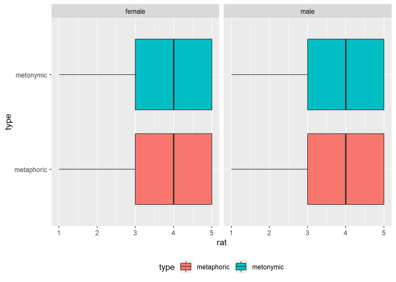
As the graph suggests, there seem to be no systematic differences in terms of how men and women perceive the comprehensibility of both metaphors and metonomies. Let’s now plot the ratings in terms of age.
rat_comp %>%
  ggplot(aes(rat, type)) +
  geom_boxplot(aes(fill = type)) +
  facet_wrap( ~ age) +
  theme(legend.position = "bottom")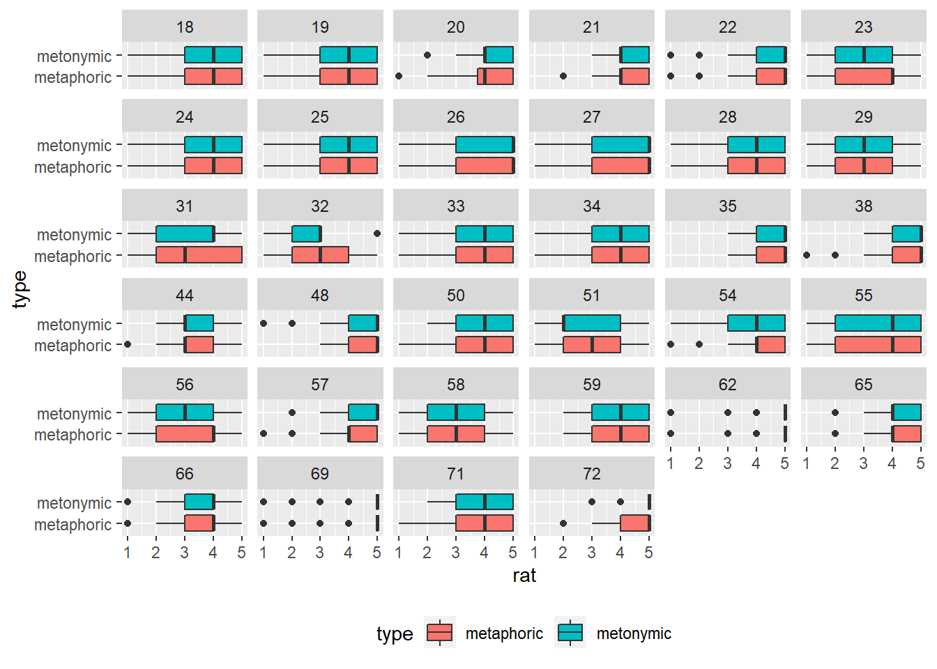
This is an interesting plot: what we see is the ratings facetted in terms of all the 34 different ages reported by respondents. Just by glancing at the graph, we see that there is variability in terms of how people of different ages rated the idioms, on average metaphors and metonomies being rated similarly, despite different patterns in some of the facets. Let’s now collapse the ages into more representative age groups, such as how they are usually presented in surveys. For that, we will need to wrangle our data some more. What we’ll do is that we’ll create a new variable, called age_group, which is based on groupings of younger, middle-aged, and older respondents. For that, we’re using the function mutate() from dplyr, which we first encountered in the exercises from session 1. Within our mutate() call we’re using another function called case_when(), which basically allows us to vectorize multiple if-else statements. Let’s see how that works.
rat_comp <- rat_comp %>%
  mutate(age_group = case_when(age >= 18 & age <= 24 ~ "18-24",
                               age >= 25 & age <= 54 ~ "25-54",
                               age >= 55 & age <= 64 ~ "55-64",
                               age >= 65 ~ "65+"))
What we did was to create age_group on the basis of grouping of values from age, such as specified in the call. We can now replace age with age_group in our code and see how the new plot looks like.
rat_comp %>%
  ggplot(aes(rat, type)) +
  geom_boxplot(aes(fill = type)) +
  facet_wrap( ~ age_group) +
  theme(legend.position = "bottom")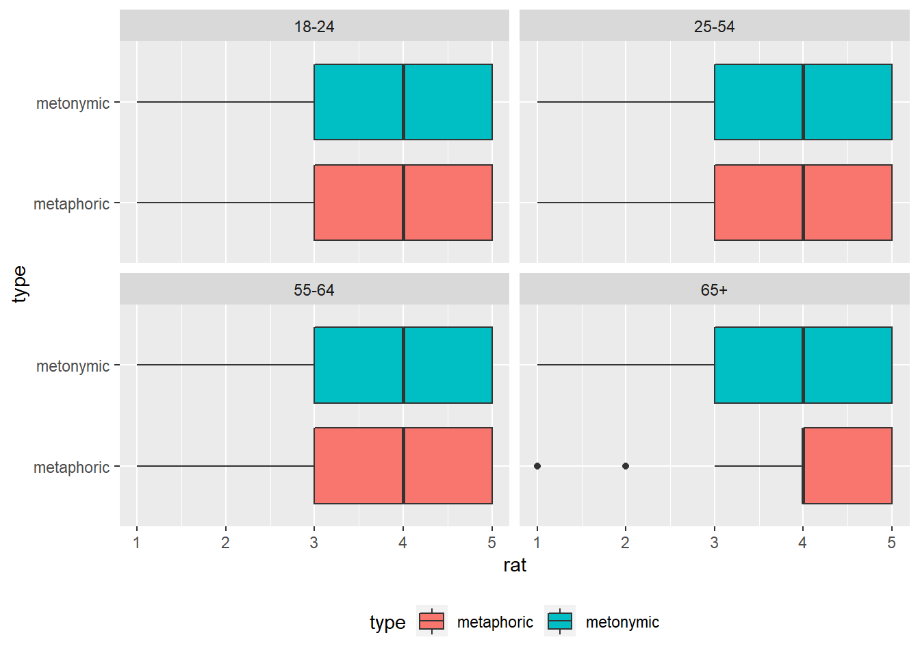
This plot shows that, despite variability in some of the facets in the plot above, the ratings are the same across three of the four binned age groups, the exception being adults who are older than 65. All in all, the median comprehensibility of both metaphors and metonomies is still 4 on the 5-point scale. Let’s now try to combine this plot with the earlier plot where we grouped participants by gender. For that, we need to add gender to our facet_wrap() call.
rat_comp %>%
  ggplot(aes(rat, type)) +
  geom_boxplot(aes(fill = type)) +
  facet_wrap(gender ~ age_group) +
  theme(legend.position = "bottom")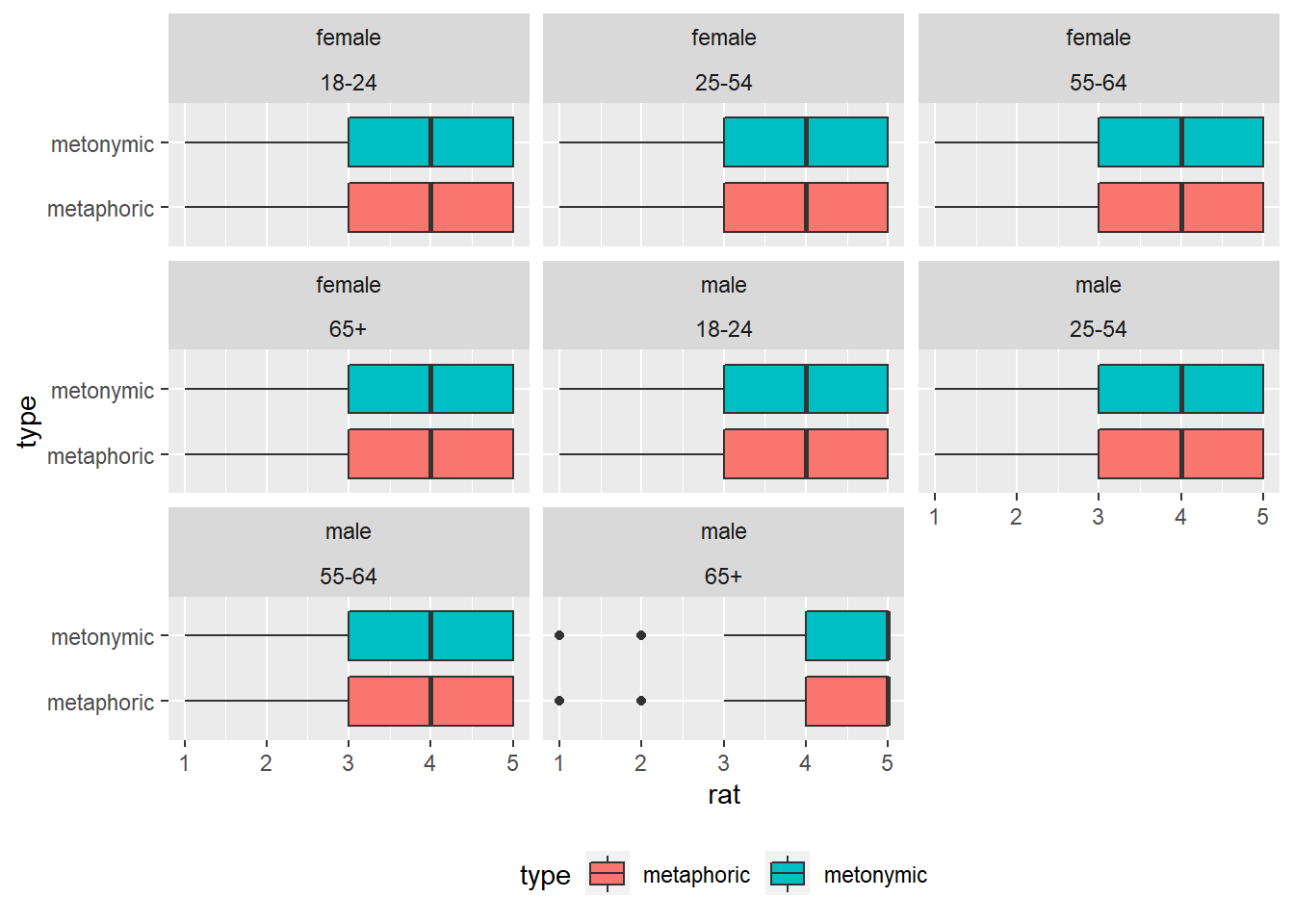
This plot confirms what we had already seen separately in the gender and age plots, namely that, on average, the ratings are consistent across men and women as well as across different age groups. The outliers seem to be men who are older than 65. The current plot works well for the purposes of exploring the data, but in case we would like to have something which is a bit more transparent to other viewers, we might want to line the facets for each gender in their own rows. Let’s change that by specifying the number of rows in our facet_wrap() call.
rat_comp %>%
  ggplot(aes(rat, type)) +
  geom_boxplot(aes(fill = type)) +
  facet_wrap(gender ~ age_group, nrow = 2) +
  theme(legend.position = "bottom")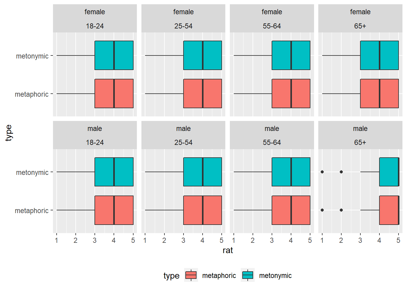
Note that if we had used facet_grid(), which is an alternative to facet_wrap(), we would have had achieved a similar end result without having to specify the number of desired rows, as the two functions work differently and have different arguments.
rat_comp %>%
  ggplot(aes(rat, type)) +
  geom_boxplot(aes(fill = type)) +
  facet_grid(gender ~ age_group) +
  theme(legend.position = "bottom")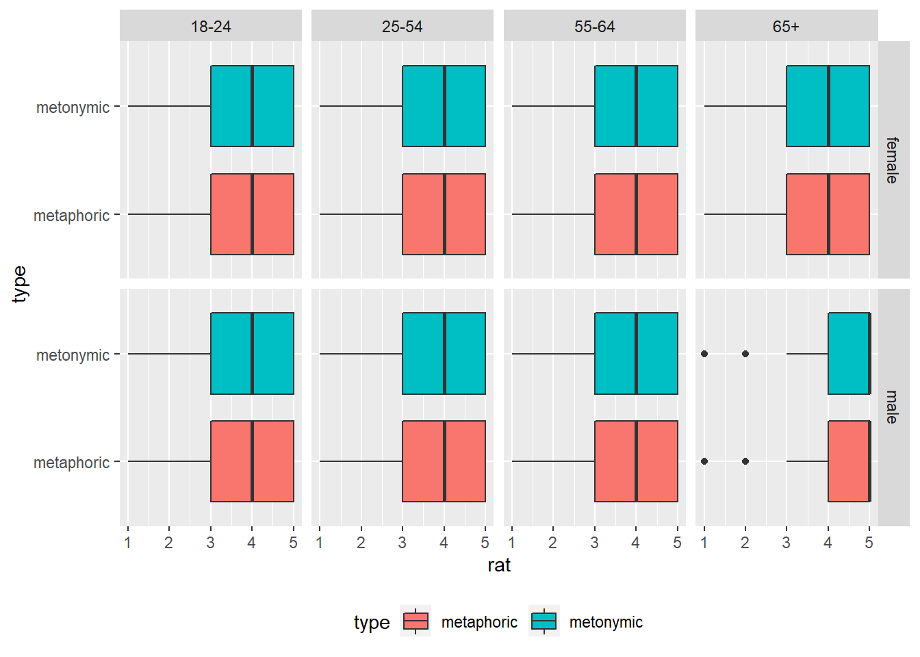
Just before we move on to improving the aesthetics of our plots, let’s try to explore the data in terms of one last variable, namely the specific idioms that participants rated. Before we plot the data, let’s double-check how many items there were in total. Let’s use the function unique(), which can be applied to our vector item to single out all unique values.
unique(rat_comp$item)## [1] 1 2 3 4 5 6 7 8 9 10 11 12 13 14 15 16 17 18
## [19] 19 20 21 22 23 24 25 26 27 28 29 30 31 32 33 34 35 36
## [37] 37 38 39 40 41 42 43 44 45 46 47 48 49 50 51 52 53 54
## [55] 55 56 57 58 59 60 61 62 63 64 65 66 67 68 69 70 71 72
## [73] 73 74 75 76 77 78 79 80 81 82 83 84 85 86 87 88 89 90
## [91] 91 92 93 94 95 96 97 98 99 100 101 102 103 104 105 106 107 108
## [109] 109 110 111 112 113 114 115 116 117 118 119 120 121 122 123 124 125 126
## [127] 127 128 129 130 131 132 133 134 135 136 137 138 139 140 141 142 143 144
## [145] 145 146 147 148 149 150 151 152 153 154 155 156 157 158 159 160 161 162
## [163] 163 164 165 166 167 168 169 170 171 172 173 174 175 176 177 178 179 180
## [181] 181 182 183 184 185 186 187 188 189 190 191 192 193 194 195 196 197 198
## [199] 199 200 201 202 203 204 205 206 207 208 209 210 211 212 213 214 215 216
## [217] 217 218 219 220 221 222 223 224 225 226 227 228 229 230 231 232 233 234
## [235] 235 236 237 238 239 240 241 242 243 244That means that we have 244 items in total, which might be complicated to plot. Let’s give it a go in any case and see what we get. We’re adding item as a grouping variable within facet_wrap().
rat_comp %>%
  ggplot(aes(rat, type)) +
  geom_boxplot(aes(fill = type)) +
  facet_wrap( ~ item) +
  theme(legend.position = "bottom")
The resulting plot is, as expected, simply impossible to parse. We will have to find some alternative way of exploring the items. What we are interested in, ultimately, is in having an overview of the amount of variability in the rated idioms. Since we know that the median rating is 4, perhaps we can use that to break down the responses into smaller groups. Let’s calculate, for each expression type, the relative number of items rated as more than 4 and less than 4. For that, we first group the items by type. Then, we create a variable called median_split, which indicates whether the rating for a given item is equal to or smaller/ larger than the median. We then group our data by type and our new variable median_split and summarize the relative number of occurrences.
rat_comp %>%
  group_by(type) %>%
  mutate(median_split = case_when(rat > 4 ~ "5",
                                  rat < 4 ~ "1,2,3",
                                  rat == 4 ~ "4")) %>%
  group_by(type, median_split) %>%
  summarize(n = n()) %>%
  mutate(freq = n / sum(n))
## `summarise()` regrouping output by 'type' (override with `.groups` argument)## # A tibble: 6 x 4
## # Groups: type [2]
## type median_split n freq
## <chr> <chr> <int> <dbl>
## 1 metaphoric 1,2,3 3768 0.355
## 2 metaphoric 4 2950 0.278
## 3 metaphoric 5 3908 0.368
## 4 metonymic 1,2,3 2064 0.352
## 5 metonymic 4 1648 0.281
## 6 metonymic 5 2154 0.367The information we generated tells us, in numbers, what we had already inferred from our graphical representation of the data, namely that most of the rating mass lies on the upper end of the scale, over points 4 and 5. In order to get more detailed information about each item, we’d have to add item to our grouping call.
rat_comp %>%
  group_by(type) %>%
  mutate(median_split = case_when(rat > 4 ~ "5",
                                  rat < 4 ~ "1,2,3",
                                  rat == 4 ~ "4")) %>%
  group_by(item, type, median_split) %>%
  summarize(n = n()) %>%
  mutate(freq = n / sum(n))
## `summarise()` regrouping output by 'item', 'type' (override with `.groups` argument)## # A tibble: 732 x 5
## # Groups: item, type [244]
## item type median_split n freq
## <dbl> <chr> <chr> <int> <dbl>
## 1 1 metaphoric 1,2,3 3 0.0469
## 2 1 metaphoric 4 13 0.203
## 3 1 metaphoric 5 48 0.75
## 4 2 metaphoric 1,2,3 11 0.169
## 5 2 metaphoric 4 26 0.4
## 6 2 metaphoric 5 28 0.431
## 7 3 metaphoric 1,2,3 26 0.4
## 8 3 metaphoric 4 19 0.292
## 9 3 metaphoric 5 20 0.308
## 10 4 metaphoric 1,2,3 12 0.185
## # ... with 722 more rowsWhat we now get is a detailed view of how each item was rated according to our tripartite division of the data around the median. From here on, in order to further explore the items, we’d have to conduct a more thorough inspection of the numbers in the table. We could look, for instance, for those items that received similar ratings, and then inspect the actual idioms to see if there are any commonalities between them. This is, of course, something that requires not only a qualitative view of the data but also expert knowledge about the actual target domain. Because of that, we’re not exploring this data any further, but this should serve to show that data exploration consists of a mix between visualization, wrangling, and numerical/ statistical summarizing. The best place to start is, just liked we did, with plots and graphical representations of the data, but usually several iterations between different techniques will be required to get at interesting and relevant data patterns.
3.3 Enriching the base visualizations
Having laid out some base plots and explored the data along some of its secondary dimensions, we’re now in the position to decide what aspects of our data we want to highlight and communicate to our audience. In order to do that, we are going to go through the steps of producing camera-ready visualizations of the data, taking into account what we learned about it and what we deem interesting to be communicated.
As a reminder, we are dealing with categorical data, where each ‘value’ consists of a category, in our case one point on a 5-point psychometric scale measuring properties related to idiom literalness. More specifically, our data is ordinal, meaning that the different categories are ranked, as the task participants were asked to perform consisted of rating, for example, the comprehensibility of each idiom they read using the provided 5-point scale. Now, our main goal is to highlight any potentially systematic differences between the participant ratings as a function of the experimental conditions. As we saw, the main contrast between metaphors and metonomies seems to hold across different sub-populations of our sample, the minor differences found in terms of age perhaps not being relevant to the point that they deserve being communicated in a plot of its own. Because of that, let’s focus on communicating the main results, namely the lack of systematic difference in comprehensibility between metaphors and metonomies, and the fact that both were rated, on average, as quite easy to understand, a 4 on the 5-point scale. Before we plot our data, let’s double-check how it’s represented in R.
str(rat_comp$rat)## num [1:16492] 4 2 2 1 1 2 3 3 2 1 ...As we can see, the ratings are coded as numeric, although we know that they represent, in fact, ordinal data. We managed to plot the data before without any problems, but let’s see what happens if we convert rat to a factor and try to plot it then.
rat_comp$rat <- as.factor(rat_comp$rat)Let’s start by re-plotting the comprehensibility ratings using our basic and straightforward ggplot2 code from above. Remember that all we have to do to create a basic graphical representation of our data is to specify the required arguments in the ggplot() function, namely aes(), which requires a variable to be plotted to the x-axis – our experimental conditions, that is, the two idiom types – and one variable to be plotted to the y-axis – our ratings. We subsequently tell ggplot() to plot the data using boxplots, which we decided was going to be our geom of choice to highlight the patterns of interest in the data.
rat_comp %>%
  ggplot(aes(type, rat)) +
  geom_boxplot()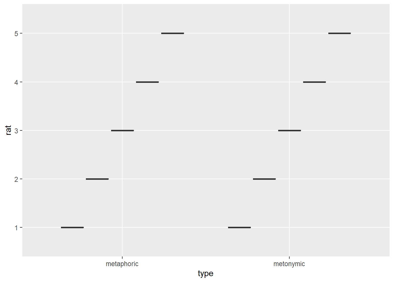
That does not look good at all. The reason why we get this odd result is because we’re feeding geom_boxplot(), which takes a continuous and a discrete variable, with two discrete variables, somewhat of a similar problem to what happened to us earlier when we tried feeding geom_point() with the ratings. Let’s change the ratings back to numeric and try again.
rat_comp$rat <- as.numeric(as.character(rat_comp$rat))

rat_comp %>%
  ggplot(aes(type, rat)) +
  geom_boxplot()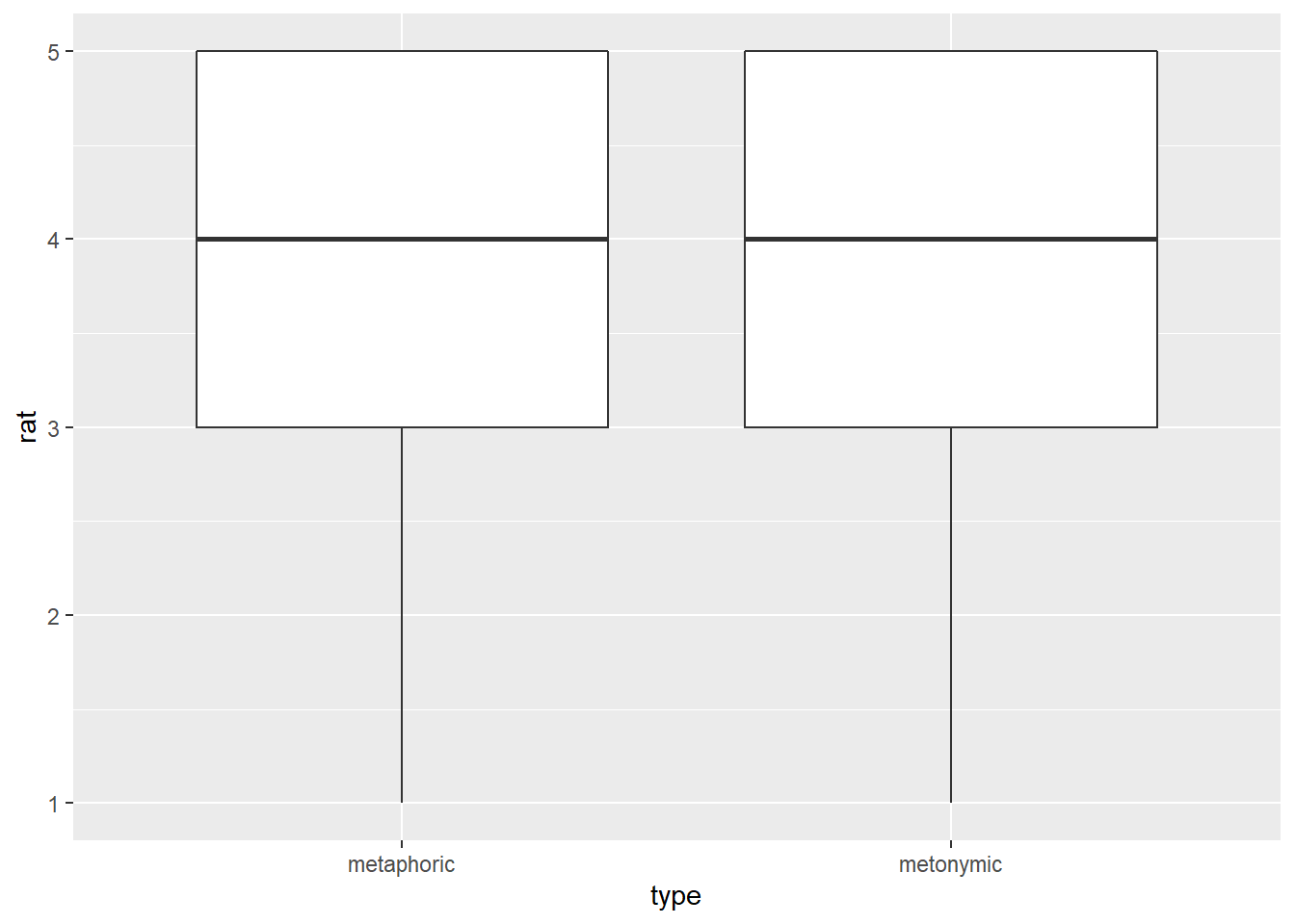
This works just fine. Now that we have the basic data patterns laid out, let’s start refining our plot, little by little, so it looks increasingly better, both in terms of transparency and effectiveness but also in terms of aesthetics. The first thing we are going to do is to flip the boxplots, so they are plotted horizontally as opposed to vertically. Since our main goal with this visualization is to allow our audience to notice where most of the rating mass lies on the scale, it makes sense to plot the scale horizontally, so one can easily notice the data spread for each group but also any differences between groups, which will be plotted one on top of the other. Let’s do that by reversing our x and y arguments in the ggplot() function, just like we did earlier.
rat_comp %>%
  ggplot(aes(rat, type)) +
  geom_boxplot()
This works just as intended. In some cases, however, reverting the axes in the ggplot() function will not produce the intended result. Luckily, we can also flip the x, y coordinates without changing the order of the arguments within the ggplot() call. To understand how flipping coordinates works, notice what happens if we add the coord_flip() call to our code.
rat_comp %>%
  ggplot(aes(rat, type)) +
  geom_boxplot() +
  coord_flip()
3.3.1 Modifying major elements of the plot
Now that we have our data plotted the way we would like it to be, let’s work on some further adjustments to the base plot which will greatly improve the effectiveness of our data communication. Remember that there are a couple of useful ways of highlight and contrasting visual elements. Relevant for this case is the manipulation of color and fill scales. First, let’s assign different fills to each experimental condition, which is the variable assigned to the y-axis.
rat_comp %>%
  ggplot(aes(rat, type, fill = type)) +
  geom_boxplot()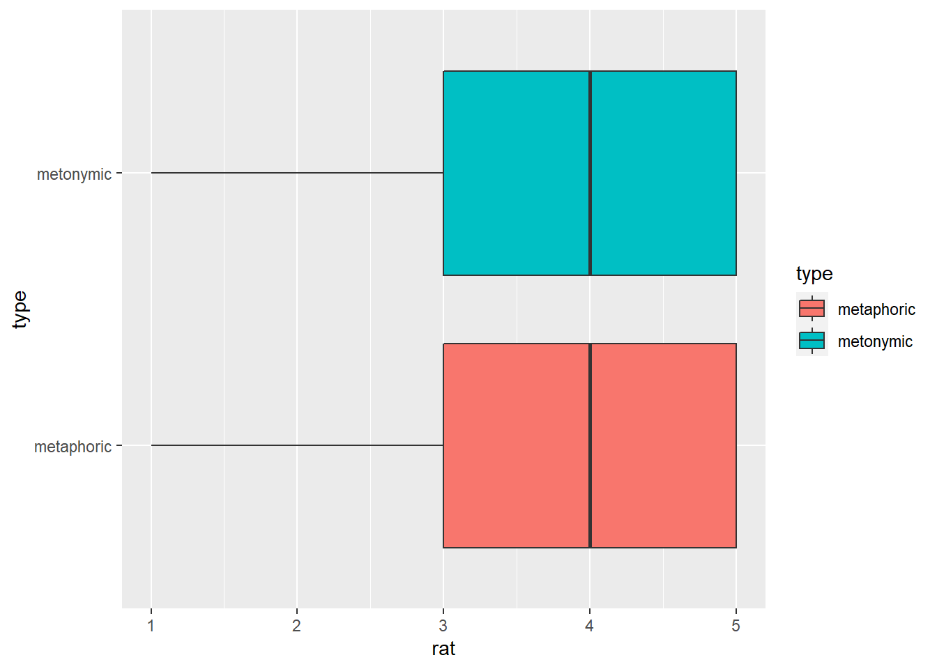
Now each condition is represented by a different color. Let’s change the color palette and slightly increase the transparency of the filled colors. For the color itself, we need to specify a new palette in a function that refers to our fill scale, namely scale_fill_brewer(). For the transparency, we modify the alpha parameter within our geom.
rat_comp %>%
  ggplot(aes(rat, type, fill = type)) +
  geom_boxplot(alpha = .7) +
  scale_fill_brewer(palette = "Set2")
Now let’s remove the gray background so as to make the plot somewhat cleaner. Let’s also thicken the lines which surround and extend from the boxplots, the boxplot whiskers, in order to create a sharper contrast between the boxes and the white background. For the lines, we need to adjust the lwd argument within geom_boxplot(), while for the background we’re applying a new theme to the plot, namely them_minimal(), which, among other things, removes the gray background.
rat_comp %>%
  ggplot(aes(rat, type, fill = type)) +
  geom_boxplot(alpha = .7, lwd = 1.2) +
  scale_fill_brewer(palette = "Set2") +
  theme_minimal()
3.3.2 Refining minor elements of the plot
As it is, the plot looks pretty good already, the most important aspects of the underlying data appropriately represented and well clearly visible. Now we can fix minor issues which arguably only contribute cosmetically to the plot, though when considered together with the previous changes make an astounding impact to the overall quality of the resulting visualization.
Firs, let’s get rid of unnecessary elements. Let’s remove the grid lines on the y-axis extending horizontally from the condition names. Let’s also get rid of the axis titles, which only clutter the plot, as well as the legend that appeared when we added fills to the plot. We’re doing all of those things using the theme() function, which we had already encountered before. theme() takes several arguments which relate to, for example, the legend of the plot, the scales, as well as the labels and titles. We’re specifying that we’d like to remove the title axes, as in axis.title.x = element_blank(), and also telling ggplot() to remove the major grids of the y-axis, which are always plotted by default and not always necessary. Finally, we’re also calling legend_position(), and specifying that the legend should be removed altogether.
rat_comp %>%
  ggplot(aes(rat, type, fill = type)) +
  geom_boxplot(alpha = .7, lwd = 1.2) +
  scale_fill_brewer(palette = "Set2") +
  theme_minimal() +
  theme(axis.title.x = element_blank(), axis.title.y = element_blank(),
        panel.grid.major.y = element_blank(), legend.position = "none")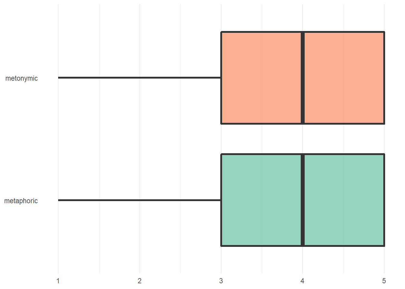
Now let’s improve the quality of the labels on the different axes. Let’s make them more visible by increasing their size and making them bold. Notice how we specify axis.text.x = element_text(), and within that function we modify the relevant parameters.
rat_comp %>%
  ggplot(aes(rat, type, fill = type)) +
  geom_boxplot(alpha = .7, lwd = 1.2) +
  scale_fill_brewer(palette = "Set2") +
  theme_minimal() +
  theme(axis.title.x = element_blank(), axis.title.y = element_blank(),
        panel.grid.major.y = element_blank(), legend.position = "none",
        axis.text.y = element_text(face = "bold", size = 14),
        axis.text.x = element_text(face = "bold", size = 14))
The next step is to increase the distance between the labels and the actual graph. Again notice the usage of the arguments in the element_text() functions.
rat_comp %>%
  ggplot(aes(rat, type, fill = type)) +
  geom_boxplot(alpha = .7, lwd = 1.2) +
  scale_fill_brewer(palette = "Set2") +
  theme_minimal() +
  theme(axis.title.x = element_blank(), axis.title.y = element_blank(),
        panel.grid.major.y = element_blank(), legend.position = "none",
        axis.text.y = element_text(face = "bold", size = 14,
                                   margin = margin(t = 0, r = 10, b = 0, l = 0)),
        axis.text.x = element_text(face = "bold", size = 14,
                                   margin = margin(t = 10, r = 0, b = 0, l = 0)))
Now, let’s capitalize the labels on the y-axis. There’s at least two options to do that. We could recode the underlying factor in rat_comp, though that would change the actual data representation in R. A less permanent solution is to tell ggplot() to replace the existing labels with new ones, which will not change the underlying data representation.
rat_comp %>%
  ggplot(aes(rat, type, fill = type)) +
  geom_boxplot(alpha = .7, lwd = 1.2) +
  scale_fill_brewer(palette = "Set2") +
  theme_minimal() +
  theme(axis.title.x = element_blank(), axis.title.y = element_blank(),
        panel.grid.major.y = element_blank(), legend.position = "none",
        axis.text.y = element_text(face = "bold", size = 14,
                                   margin = margin(t = 0, r = 10, b = 0, l = 0)),
        axis.text.x = element_text(face = "bold", size = 14,
                                   margin = margin(t = 10, r = 0, b = 0, l = 0))) +
  scale_y_discrete(labels = c("metonymic" = "Metonymic", "metaphoric" = "Metaphoric"))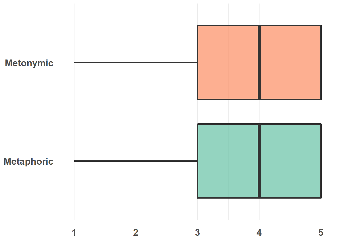
Last, let’s add a title to the plot. Note that in many cases titles need not be added to plots, as that can be done straight in the text/ presentation editor one is using (including R, as we will see later).
rat_comp %>%
  ggplot(aes(rat, type, fill = type)) +
  geom_boxplot(alpha = .7, lwd = 1.2) +
  scale_fill_brewer(palette = "Set2") +
  theme_minimal() +
  theme(axis.title.x = element_blank(), axis.title.y = element_blank(),
        panel.grid.major.y = element_blank(), legend.position = "none",
        axis.text.y = element_text(face = "bold", size = 14,
                                   margin = margin(t = 0, r = 10, b = 0, l = 0)),
        axis.text.x = element_text(face = "bold", size = 14,
                                   margin = margin(t = 10, r = 0, b = 0, l = 0)),
        plot.title = element_text(face = "bold", size = 24, hjust = .5,
                                  margin = margin(t = 10, r = 0, b = 40, l = 0))) +
  scale_y_discrete(labels = c("metonymic" = "Metonymic", "metaphoric" = "Metaphoric")) +
  ggtitle("Comprehensibility ratings")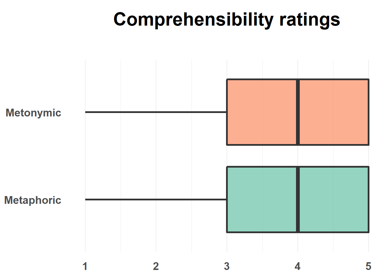
To finish up, let’s make similar changes to our combined plot, which will require some further adjustments. Let’s use the exact same code from above, replacing type with study on the y-axis and bringing the legend back. Let’s also center the title of our legend and give the plot the right name.
rat_combi %>%
  ggplot(aes(rat, study, fill = type)) +
  geom_boxplot(alpha = .7, lwd = 1.2) +
  scale_fill_brewer(palette = "Set2") +
  theme_minimal() +
  theme(axis.title.x = element_blank(), axis.title.y = element_blank(),
        panel.grid.major.y = element_blank(), legend.title.align = 0.5,
        axis.text.y = element_text(face = "bold", size = 14,
                                   margin = margin(t = 0, r = 10, b = 0, l = 0)),
        axis.text.x = element_text(face = "bold", size = 14,
                                   margin = margin(t = 10, r = 0, b = 0, l = 0)),
        plot.title = element_text(face = "bold", size = 24, hjust = .5,
                                  margin = margin(t = 10, r = 0, b = 40, l = 0))) +
  scale_y_discrete(labels = c("metonymic" = "Metonymic", "metaphoric" = "Metaphoric")) +
  ggtitle("Transparency ratings")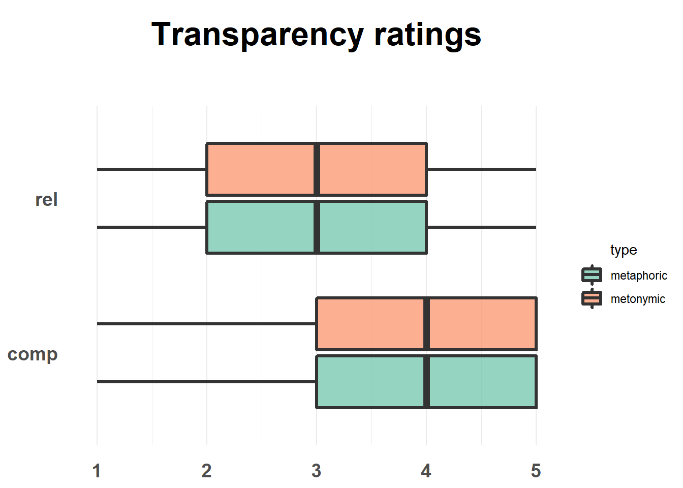
Much like we did earlier, let’s adjust the distance between the boxes and the groups in the geom_boxplot() call. We should also fix the labels, both on the y-axis and in the legend. We already know how to change the distance between our boxes, in fact we can just recover our code from earlier. As for the labels, notice the new arguments in the scale_fill_brewer() call.
rat_combi %>%
  ggplot(aes(rat, study, fill = type)) +
  geom_boxplot(alpha = .7, lwd = 1.2, width = .5, position = position_dodge(width = .7)) +
  scale_fill_brewer(palette = "Set2",
                    name = "Idiom type",
                    labels = c("metaphoric" = "Metaphoric", "metonymic" = "Metonymic")) +
  theme_minimal() +
  theme(axis.title.x = element_blank(), axis.title.y = element_blank(),
        panel.grid.major.y = element_blank(), legend.title.align = 0.5,
        axis.text.y = element_text(face = "bold", size = 14,
                                   margin = margin(t = 0, r = 10, b = 0, l = 0)),
        axis.text.x = element_text(face = "bold", size = 14,
                                   margin = margin(t = 10, r = 0, b = 0, l = 0)),
        plot.title = element_text(face = "bold", size = 24, hjust = .5,
                                  margin = margin(t = 10, r = 0, b = 40, l = 0))) +
  scale_y_discrete(labels = c("rel" = "Relation", "comp" = "Comprehensibility")) +
  ggtitle("Transparency ratings")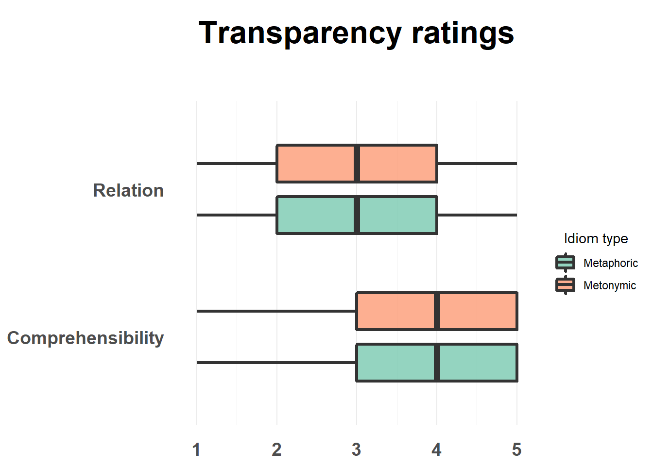
One more thing to do: let’s play with transparency so as to highlight the contrast between the two plotted measures. Here we’re using a trick which is to specify that alpha should refer to an interaction between our two grouping variables, type and study, and then to set alpha values manually for the different combinations of the two variables. Let’s make the relation boxes look bright and the comprehensibility ones look dark.
rat_combi %>%
  ggplot(aes(rat, study, fill = type, alpha = interaction(type, study))) +
  geom_boxplot(lwd = 1.2, width = .5, position = position_dodge(width = .7)) +
  scale_fill_brewer(palette = "Set2",
                    name = "Idiom type",
                    labels = c("metaphoric" = "Metaphoric", "metonymic" = "Metonymic")) +
  scale_alpha_manual(values = c(1, 1, .4, .4), guide = FALSE) +
  theme_minimal() +
  theme(axis.title.x = element_blank(), axis.title.y = element_blank(),
        panel.grid.major.y = element_blank(), legend.title.align = 0.5,
        axis.text.y = element_text(face = "bold", size = 14,
                                   margin = margin(t = 0, r = 10, b = 0, l = 0)),
        axis.text.x = element_text(face = "bold", size = 14,
                                   margin = margin(t = 10, r = 0, b = 0, l = 0)),
        plot.title = element_text(face = "bold", size = 24, hjust = .5,
                                  margin = margin(t = 10, r = 0, b = 40, l = 0))) +
  scale_y_discrete(labels = c("rel" = "Relation", "comp" = "Comprehensibility")) +
  ggtitle("Transparency ratings")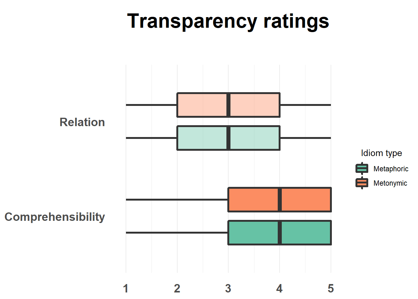
This worked as intended. In order to achieve our end result and thus highlight the contrasts of interest, we made use of color and transparency, combined with a vertical collocation of the two contrasted groups. We could have used other combinations of techniques, though. As we’ve seen, these can include, among other things, changing the color of our geoms, changing the geoms themselves, facetting groups, but also changing the size or orientation of the plotted elements.
As an example of such possible variations, let’s use color instead of fill to highlight type. Let’s also change the color of the boxes to gray, to increase the visual contrast with the white background. This should also help us understand the difference between fill and color.
rat_combi %>%
  ggplot(aes(rat, study, color = type)) +
  geom_boxplot(fill = "light gray", lwd = 1.2, width = .5,
               position = position_dodge(width = .7)) +
  scale_color_brewer(palette = "Set2",
                    name = "Idiom type",
                    labels = c("metaphoric" = "Metaphoric", "metonymic" = "Metonymic")) +
  theme_minimal() +
  theme(axis.title.x = element_blank(), axis.title.y = element_blank(),
        panel.grid.major.y = element_blank(), legend.title.align = 0.5,
        axis.text.y = element_text(face = "bold", size = 14,
                                   margin = margin(t = 0, r = 10, b = 0, l = 0)),
        axis.text.x = element_text(face = "bold", size = 14,
                                   margin = margin(t = 10, r = 0, b = 0, l = 0)),
        plot.title = element_text(face = "bold", size = 24, hjust = .5,
                                  margin = margin(t = 10, r = 0, b = 40, l = 0))) +
  scale_y_discrete(labels = c("rel" = "Relation", "comp" = "Comprehensibility")) +
  ggtitle("Transparency ratings")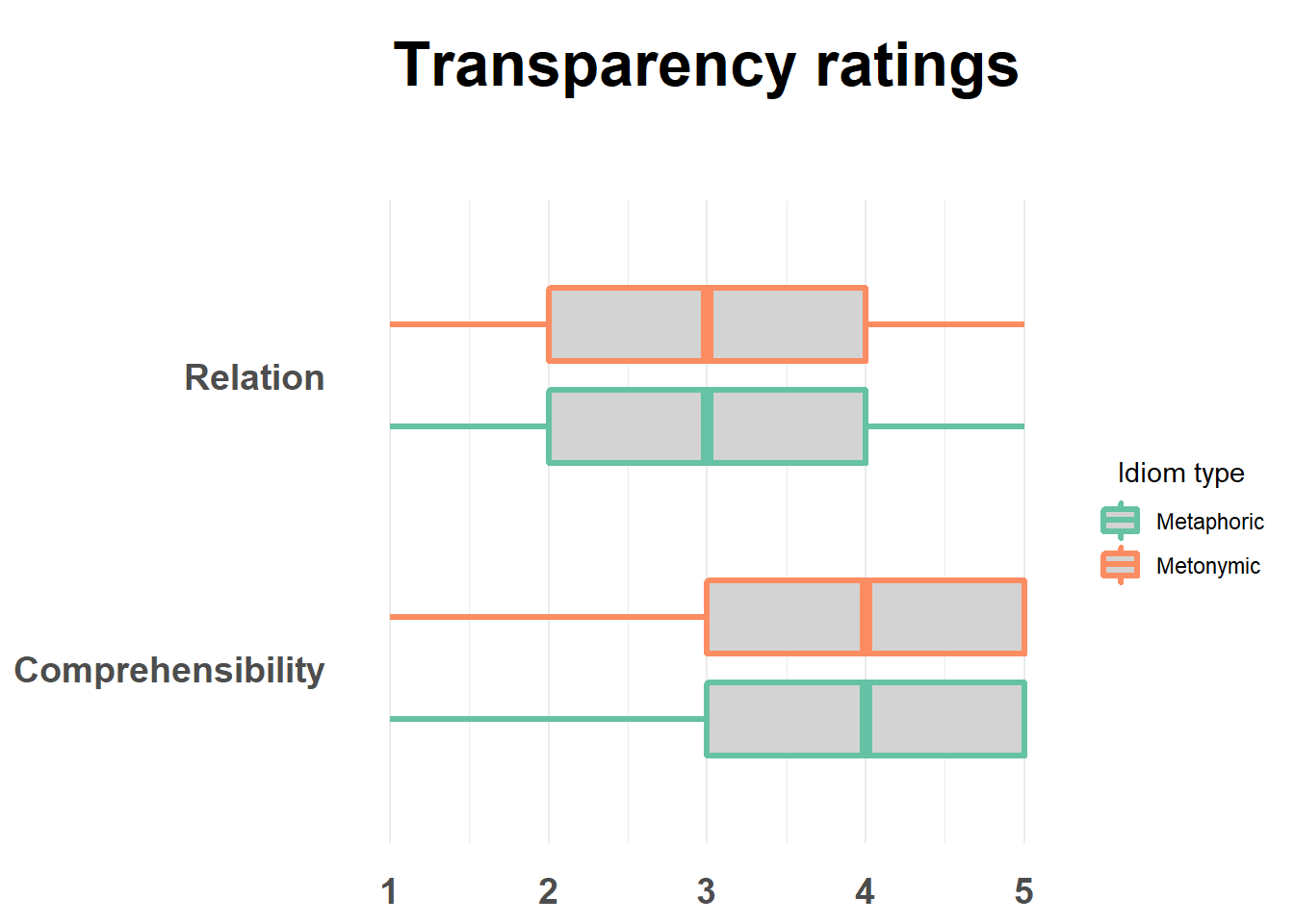
What we did was to color the lines in the boxplot according to the expression type and to fill the boxes with a specified color. Notice how color varies as a function of the variable type while color, which is manually coded, remains constant across both groups.
We can now export our plot, say if we’d like to save it locally on our machine as an image file. Let’s export the plot with transparency added to it as a .png file, which can be done using the ggsave() function. You might need to adjust the width and height arguments within ggsave() to get your plot to be exported with the right dimensions.
rat_combi %>%
  ggplot(aes(rat, study, fill = type, alpha = interaction(type, study))) +
  geom_boxplot(lwd = 1.2, width = .5, position = position_dodge(width = .7)) +
  scale_fill_brewer(palette = "Set2",
                    name = "Idiom type",
                    labels = c("metaphoric" = "Metaphoric", "metonymic" = "Metonymic")) +
  scale_alpha_manual(values = c(1, 1, .4, .4), guide = FALSE) +
  theme_minimal() +
  theme(axis.title.x = element_blank(), axis.title.y = element_blank(),
        panel.grid.major.y = element_blank(), legend.title.align = 0.5,
        axis.text.y = element_text(face = "bold", size = 14,
                                   margin = margin(t = 0, r = 10, b = 0, l = 0)),
        axis.text.x = element_text(face = "bold", size = 14,
                                   margin = margin(t = 10, r = 0, b = 0, l = 0)),
        plot.title = element_text(face = "bold", size = 24, hjust = .5,
                                  margin = margin(t = 10, r = 0, b = 40, l = 0))) +
  scale_y_discrete(labels = c("rel" = "Relation", "comp" = "Comprehensibility")) +
  ggtitle("Transparency ratings")
ggsave("ratings-transparency.png")## Saving 7 x 5 in image3.4 Session summary
As we’ve seen in our last two sessions, geoms are what shape the type of graph one ends up with when using ggplot2. The single most important aspect of a geom is what type and number of variables its aesthetics support. We’ve seen examples of geoms that take one or two variables. In the case of geoms that support two variables, like
geom_boxplot(), we saw that these can consist either of two variables of the same type, be it continuous or discrete, or a combination of both. In order to produce a plot that renders the data correctly, one needs to understand how the plotted variables are coded in R, so that they match the variable type supported by the selected geom. One also needs to understand what the data corresponds to “in the wild”, that is, in terms of its original measurement type. This might impact how the data is plotted regardless of its actual representation in R. Knowing what variables a geom requires and whether one’s data matches those requirements is a good recipe for plotting data correctly;In order to explore data for the purposes of data analysis, we saw that a good starting point is with plots and visual representations of the data. Often times, however, one will need to wrangle the data in order to produce certain plots. In addition to wrangling, which can be done with the help of many specialized packages like tidyverse’s dplyr, one usually needs to summarize the data in different ways or to calculate different descriptive statistics on the basis of the raw data, which themselves can also added to plots in different ways. Exploring a data set will usually involve a combination of visualization, wrangling, and numerical/ statistical summarizing;
In order to enrich ggplot2’s base visualizations, one can make use of different aesthetic specifications. As we’ve seen, these include specifications which affect major elements of a plot, such as
fill,color, andalpha, geom-specific arguments likelwdorlinetype, but also arguments which affect minor elements of the plot such as the legend, the title, and the axes, usually specified within thetheme()layer. Importantly, as we will see later, where an aesthetic is specified can impact how the plots looks like: whatever is called within theggplot()function will affect all layers in a plot, while aesthetics called within specific geoms will only affect that geom’s layer. In addition to specifying aesthetics, using facets or varying the mapping of variables onto thex, ycoordinates can also help highlight certain contrasts in a graph;Plots can be exported from R using the function
ggsave(), which by default saves the last plotted graph.ggsave()takes the argumentswidthandheightwhich can be modified in order to change the dimensions of the saved plot.